
You can segregate data in Excel pivot charts by putting information on different charts. For example, if you drag the Month data item to the Filters box (in the bottom half of the PivotTable Fields list), Excel adds a Month button to the worksheet (in the following figure, this button appears in cells A1 and B1).
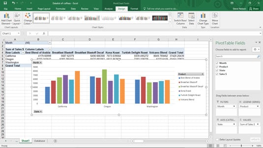
This button, which is part of the pivot table behind your pivot chart, lets you view sales information for all the months, as shown, or just one of the months. This box is by default set to display all the months (All). Things really start to happen, however, when you want to look at just one month's data.
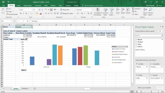
To show sales for only a single month, click the down-arrow button to the right of Month in the pivot table. When Excel displays the drop-down list, select the month that you want to see sales for and then click OK. This figure shows sales for just the month of January. This is a little hard to see, but try to see the words Month and January in cells A1 and B1.
You can also use slicers and timelines to filter data.
To remove an item from the pivot chart, simply drag the item's button back to the PivotTable Fields list.
You can also filter data based on the data series or the data category. In the case of the pivot chart shown, you can indicate that you want to see information for only a particular data series by clicking the arrow button to the right of the Column Labels drop-down list. When Excel displays the drop-down list of coffee products, select the coffee that you want to see sales for. You can use the Row Labels drop-down list in a similar fashion to see sales for only a particular state.
If you've worked with pivot tables, you might remember that you can cross-tabulate by more than one row or column items. You can do something very similar with pivot charts. You can become more detailed in your data series or data categories by dragging another field item to the Legend or Axis box.
This figure shows how the pivot table looks if you use State to add granularity to the Product data series.
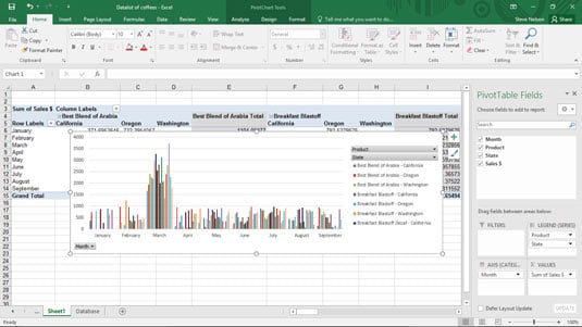
Sometimes lots of granularity in a cross-tabulation makes sense. But having multiple row items and multiple column items in a pivot table makes more sense than adding lots of granularity to pivot charts by creating superfine data series or data categories. Too much granularity in a pivot chart turns your chart into an impossible-to-understand visual mess.