
All you need in order to add great-looking infographics to an Excel worksheet is some geographically related data. The geographic regions that Excel automatically recognizes and can work with when creating infographics include
- Names of Countries, such USA, Russia, Canada, and so forth
- Names of Provinces, such as Manitoba, Ontario, British Columbia, and so forth
- Names of States, such as Maine, Connecticut, Florida, and so forth
- Two-letter state abbreviations, such CA, NY, IA, and so forth
- Postal codes, such as 94107, 78641, or SN13 9NH, WC2N 5DU, and the like
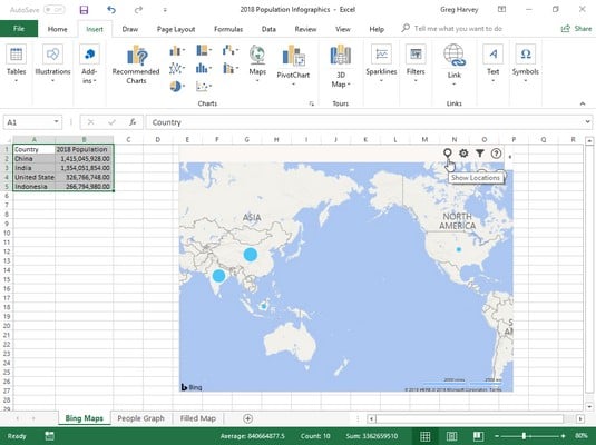 Adding a Bing Maps infographic to the illustrate the 2018 population by country data in a worksheet.
To create this Bing Maps infographic in your Excel worksheet, follow these steps:
- Position the cell cursor in one of the cells of the table with the population data (A1:B5).
- Click the Bing Maps button on the drop-down menu attached to the Add-ins button on Insert tab of the Ribbon (or press Alt+NZ1A1).
- Click the Show Locations button (the leftmost one in the top row) of the Welcome to Bing Maps graphic.
The following image shows the People Graph infographic created from the same population data table an Excel worksheet. To create this infographic, follow these steps:
- Open the worksheet with the population data table.
- Click the People Graph button on the drop-down menu attached to the Add-ins button on Insert tab of the Ribbon (or press Alt+NZ1A2).
- Click the Data button (the one with tiny worksheet icon) at the top of the Numbers About the App default infographic.
When you click the Data button, a Data panel appears in the default infographic where you can select the data to be represented as well as change the title.
- Select the placeholder title text (Numbers About the App) in the Title text box and then replace it by entering your own title.
- Click the Select Your Data button in the Data panel right above the Title text box and then drag through the cell range with the labels and values you want used in the new infographic before you click the Create button.
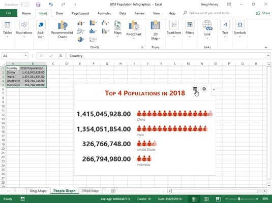 Adding a People Graph infographic to the illustrate the 2018 population by country data in a worksheet.
As soon as you click the Create button, the People Graph add-in replaces its default infographic with the title and Excel data you specified. You can then use its Settings button (the one with the cog icon) to modify its formatting if you so choose.
The image below shows the Filled Map chart created using the same population worksheet data as for the Bing Maps and People Graph infographics above. This is the easiest of the three to create. All you have to do is position the cell cursor in one of the Excel cells with the population data before clicking the Maps button on the Insert tab of the Ribbon.
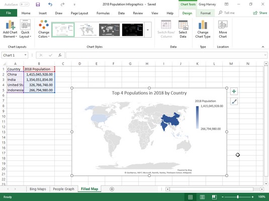 Adding a Filled Map chart infographic to the illustrate the 2018 population by country data in a worksheet.
Excel immediately created the Filled Map chart shown above. All that was done then was to replace the Chart Title placeholder with the Population (2018) chart title shown here.