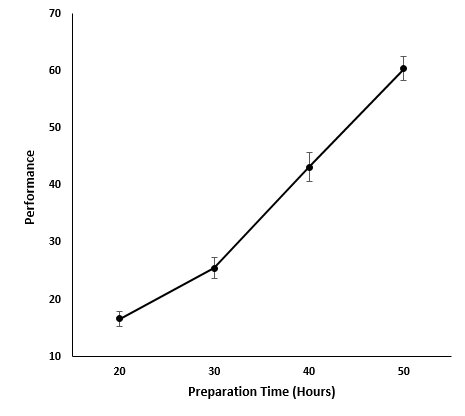
Here’s an example of a situation where this arises. The data are (fictional) test scores for four groups of people. Each column header indicates the amount of preparation time for the eight people within the group. You can use Excel’s graphics capabilities to draw the graph. Because the independent variable is quantitative, a line graph is appropriate.
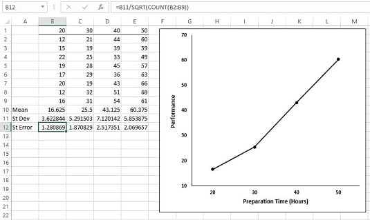
For each group, you can use AVERAGE to calculate the mean and STDEV.S to calculate the standard deviation. You can calculate the standard error of each mean. Select cell B12, so the formula box shows you that you calculated the standard error for Column B via this formula:
=B11/SQRT(COUNT(B2:B9))
The trick is to get each standard error into the graph. In Excel 2016 this is easy to do, and it’s different from earlier versions of Excel. Begin by selecting the graph. This causes the Design and Format tabs to appear. Select
Design | Add Chart Element | Error Bars | More Error Bars Options
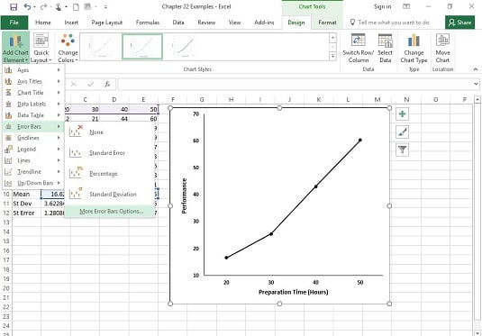
In the Error Bars menu, you have to be careful. One selection is Standard Error. Avoid it. If you think this selection tells Excel to put the standard error of each mean on the graph, rest assured that Excel has absolutely no idea of what you’re talking about. For this selection, Excel calculates the standard error of the set of four means — not the standard error within each group.
More Error Bar Options is the appropriate choice. This opens the Format Error Bars panel.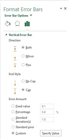
In the Direction area of the panel, select the radio button next to Both, and in the End Style area, select the radio button next to Cap.
One selection in the Error Amount area is Standard Error. Avoid this one, too. It does not tell Excel to put the standard error of each mean on the graph.
Scroll down to the Error Amount area and select the radio button next to Custom. This activates the Specify Value button. Click that button to open the Custom Error Bars dialog box. With the cursor in the Positive Error Value box, select the cell range that holds the standard errors ($B$12:$E$12). Tab to the Negative Error Value box and do the same.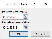
That Negative Error Value box might give you a little trouble. Make sure that it’s cleared of any default values before you enter the cell range.
Click OK in the Custom Error Bars dialog box and close the Format Error Bars dialog box, and the graph looks like this.