
Charts are built for the purpose of presenting information that is easier to digest visually than the raw data. Sometimes two charts may be easier for your audience to digest than one chart.
If you’re not sure what data will look like visually, you can highlight it and press F11 to display an “instant chart” on a new tab.
Creating a summary sheet with visuals will help the viewer make sense of the financial model, but deciding which data to display is difficult. Your decision of what to show will depend on a couple of factors:- What is your key message? Sometimes the reason that you built the financial model in the first place is to convey a particular message to the audience — for example, “Supply costs are escalating. We need to increase pricing or risk eroding profits.” In this example, you would show the supply cost per unit over time, versus the price over time, highlighting the key message for the decision maker.
- What is your audience interested in? Sometimes you’ve built a model for a particular purpose, but you know that the audience is particularly interested in a certain cost or ratio, so this is what you need to highlight in your output report.
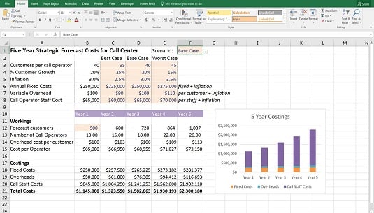
The model calculates the costings for the next five years under different drop-down scenarios. To create a summary of the model’s output, you have to decide which data to display. If you know that the audience is only interested in the costings section, you can create a chart based on the costings data at the bottom of the page.
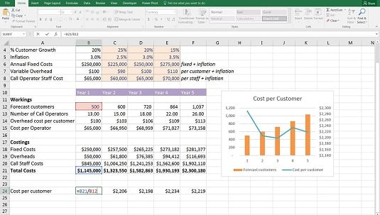
This case study is based on a simplified version of a model I built for a real-life client of mine. I know that the client was actually interested in the cost to serve each customer — finding this out was one of the purposes of building this model in the first place. So, add the cost per customer in row 24 with the formula =B21/B12 and copy it across the row.
The chart shows the cost per customer, as well as the forecast number of customers, so you can see that although the number of customers increases steadily, the cost per customer fluctuates over the five-year period.
You can see in this case study that deciding which data to display can depend on what the message of the model is, as well as what the audience is interested in.