After you create a pivot table in Excel 2007, you can create a pivot chart to display its summary values graphically. You also can format a pivot chart to improve its appearance. You can use any of the chart types available with Excel when you create a pivot chart.
Create a pivot chart
Follow these steps to create a pivot chart based on an existing pivot table in a worksheet:
Create the pivot table and then click any cell in the pivot table on which you want to base the chart.
Click the PivotChart command button in the Tools group of the PivotTable Tools Options tab.
The Create Chart dialog box appears. Remember that the PivotTable Tools contextual tab with its two tabs — Options and Design — automatically appears whenever you click any cell in an existing pivot table.
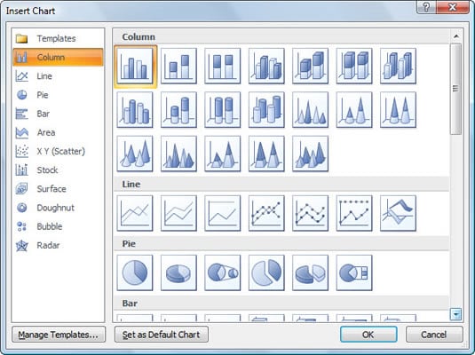 You have many design choices for your PivotChart.
Click the thumbnail of the type of chart you want to create.
Click OK.
Excel displays the pivot chart in the worksheet.
To delete the pivot chart, select a chart boundary and press the Delete key.
Format a pivot chart
As soon as you create a pivot chart, Excel displays these items in the worksheet:
Pivot chart using the type of chart you selected that you can move and resize as needed (officially known as an embedded chart).
PivotChart Filter Pane containing three drop-down lists — Axis Fields (Categories), Legend Fields (Series), and Report Filter — along with a Values field at the very bottom listing the name of the field whose values are summarized in the chart.
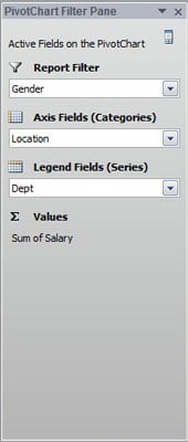 The PivotChart Filter pane helps you tease out the data that you want to show.
PivotChart Tools contextual tab divided into four tabs — Design, Layout, Format, and Analyze — each with its own set of buttons for customizing and refining the pivot chart.
The command buttons on the Design, Layout, and Format tabs attached to the PivotChart Tools contextual tab make it easy to further format and customize your pivot chart:
Design tab: Use these buttons to select a new chart style or even a brand new chart type for your pivot chart.
Layout tab: Use these buttons to further refine your pivot chart by adding chart titles, text boxes, and gridlines.
Format tab: Use these buttons to refine the look of any graphics you’ve added to the chart as well as select a new background color for your chart.