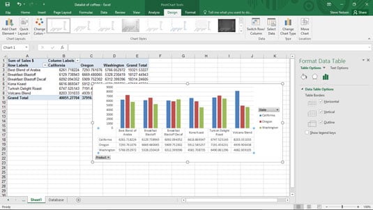
A data table just shows the plotted values in a table and adds the table to the chart. A data table might make sense for other kinds of charts, but not for pivot charts. (A data table duplicates the pivot table data that Excel creates as an intermediate step in creating the pivot chart.) Nevertheless, here's what the Data Table tab does.
When you choose the Data Table command from the Add Chart Element menu, Excel displays a menu of commands: None, With Legend Keys, No Legend Keys, and More Data Table Options. To add a data table to your chart, select the With Legend Keys or No Legend Keys command. This figure shows you what a data table looks like.
After you add a data table, Excel opens the Format Data Table pane to the window. You can use its buttons to add horizontal and vertical lines and a border to the data table. And the pane also includes a check box you use to add and remove a legend.