
After you’ve told ggplot() what data to use in R, the next step is to tell it how your data corresponds to visual elements of your plot. This mapping between data and visual aesthetics is the second element of a ggplot2 layer.
The visual elements of a plot, or aesthetics, include lines, points, symbols, colors, position . . . anything that you can see. For example, you can map a column of your data to the x-axis of your plot, or you can map a column of your data to correspond to the y-axis of your plot. You also can map data to groups, colors, or the size of points in scatterplots — in fact, you can map your data to anything that your geom supports.
You use the special function aes() to set up a mapping between data and aesthetics. Each argument to aes() maps a column in your data to a specific element in your geom.
Take a look at the code used to create the image below:
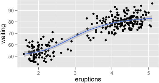
> ggplot(faithful, aes(x = eruptions, y = waiting)) +
+  geom_point() +
+  stat_smooth()
You can see that this code tells ggplot() to use the data frame faithful as the data source. And now you understand that aes() creates a mapping between the x-axis and faithful$eruptions, as well as between the y-axis and faithful$waiting.
The next thing you notice about this code is the plus (+) signs at the end of each line. In ggplot2, you use the + operator to combine the different layers of the plot.
In summary, you use the aes() function to define the mapping between your data and your plot.