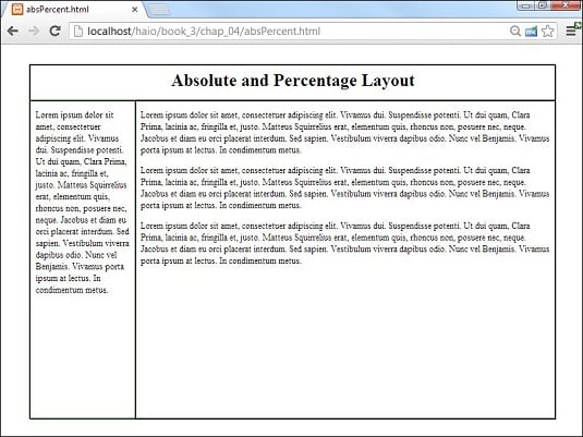
However, you can build a layout with absolute positioning and some flexibility. This image illustrates such a design.
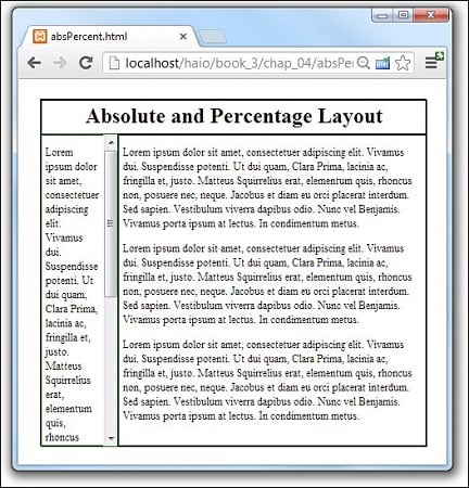
The size of this layout is attached to the size of the browser screen. It attempts to adjust to the browser while it’s resized. You can see this effect here.
The size of this layout is attached to the size of the browser screen. It attempts to adjust to the browser while it’s resized. You can see this effect here.
Having the page resize with the browser works, but it’s not a complete solution. When the browser window is small enough, the text will no longer fit without some ugly bleed-over effects. You can fix this with the overflow attribute, but then you will have scrollbars in your smaller elements.
Designing with percentages
This absolute but flexible trick is achieved by using percentage measurements. The position is still set toabsolute, but rather than defining size and position with pixels, you use percentages instead. Here’s the CSS:/* absPercent.css */
#all {
border: 1px black solid;
position: absolute;
left: 5%;
top: 5%;
width: 90%;
height: 90%;
}
#head {
border: 1px black solid;
position: absolute;
left: 0%;
top: 0%;
width: 100%;
height: 10%;
text-align: center;
}
#head h1 {
margin-top: 1%;
}
#menu {
border: 1px green solid;
position: absolute;
left: 0%;
top: 10%;
width: 18%;
height: 90%;
padding-left: 1%;
padding-right: 1%;
overflow: auto;
}
#content {
border: 1px black solid;
position: absolute;
left: 20%;
top: 10%;
width: 78%;
height: 90%;
padding-left: 1%;
padding-right: 1%;
overflow: auto;
}
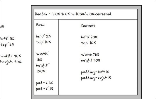
The key to any absolute positioning (even this flexible kind) is math. When you just look at the code, it isn’t clear where all those numbers come from. Look at the diagram for the page to see how all the values are derived.
Building the flexible layout
Here’s how the layout works:- Create an
allcontainer by building a div with theallID.The
allcontainer will hold all the contents of the page. It isn’t absolutely necessary in this type of layout, but it does allow for a centering effect. - Specify the size and position of all.
Imagine you want the content of the page to be centered in the browser window, so you set its height and width to 90 percent, and its
margin-leftandmargin-topto 5 percent. This sets themargin-rightandmargin-bottomto 5 percent also. These percentages refer to thealldiv’s container element, which is the body, with the same size as the browser window. - Other percentages are in relationship to the
allcontainer.Because all the other elements are placed inside
all, the percentage values are no longer referring to the entire browser window. The widths and heights for the menu and content areas are calculated as percentages of their container, which isall. - Determine the heights.
Height is usually pretty straightforward because you don’t usually have to change the margins. Remember, though, that the head accounts for 10 percent of the page space, so the height of both the menu and content needs to be 90 percent.
- Figure the general widths.
In principle, the width of the menu column is 20 percent, and the content column is 80 percent. This isn’t perfectly accurate, though.
- Compensate for margins.
You probably want some margins, or the text looks cramped. If you want 1 percent
margin-leftand 1 percentmargin-righton the menu column, you have to set the menu’s width to 18 percent to compensate for the margins. Likewise, set the content width to 78 percent to compensate for margins.
As if this weren’t complex enough, remember that Internet Explorer 6 (IE6) and earlier browsers calculate margins differently! In these browsers, the margin happens inside the content, so you don’t have to compensate for them (but you have to remember that they make the useable content area smaller). You’ll probably have to make a conditional comment style sheet to handle IE6 if you use absolute positioning.