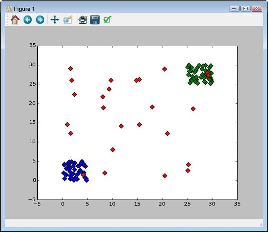
Depicting groups
Color is the third axis when working with a scatterplot. Using color lets you highlight groups so that others can see them with greater ease. The following example shows how you can use color to show groups within a scatterplot:import numpy as np
import matplotlib.pyplot as plt
x1 = 5 * np.random.rand(50)
x2 = 5 * np.random.rand(50) + 25
x3 = 30 * np.random.rand(25)
x = np.concatenate((x1, x2, x3))
y1 = 5 * np.random.rand(50)
y2 = 5 * np.random.rand(50) + 25
y3 = 30 * np.random.rand(25)
y = np.concatenate((y1, y2, y3))
color_array = ['b'] * 50 + ['g'] * 50 + ['r'] * 25
plt.scatter(x, y, s=[50], marker='D', c=color_array)
plt.show()
This example uses an array for the colors. However, the first group is blue, followed by green for the second group. Any outliers appear in red.
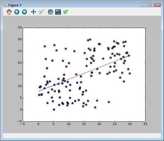
Showing correlations
In some cases, you need to know the general direction that your data is taking when looking at a scatterplot. Even if you create a clear depiction of the groups, the actual direction that the data is taking as a whole may not be clear. In this case, you add a trend line to the output. Here’s an example of adding a trend line to a scatterplot that includes groups.import numpy as np
import matplotlib.pyplot as plt
import matplotlib.pylab as plb
x1 = 15 * np.random.rand(50)
x2 = 15 * np.random.rand(50) + 15
x3 = 30 * np.random.rand(30)
x = np.concatenate((x1, x2, x3))
y1 = 15 * np.random.rand(50)
y2 = 15 * np.random.rand(50) + 15
y3 = 30 * np.random.rand(30)
y = np.concatenate((y1, y2, y3))
color_array = ['b'] * 50 + ['g'] * 50 + ['r'] * 25
plt.scatter(x, y, s=[90], marker='*', c=color_array)
z = np.polyfit(x, y, 1)
p = np.poly1d(z)
plb.plot(x, p(x), 'm-')
plt.show()
Adding a trend line means calling the NumPy polyfit() function with the data, which returns a vector of coefficients, p, that minimizes the least squares error. Least square regression is a method for finding a line that summarizes the relationship between two variables, x and y in this case, at least within the domain of the explanatory variable x. The third polyfit() parameter expresses the degree of the polynomial fit.
The vector output of polyfit() is used as input to poly1d(), which calculates the actual y-axis data points. The call to plot() creates the trend line on the scatterplot.