
The idea of an employee journey map has roots in the customer journey map — a visual document that charts the customer experience as it progresses through the stages of a company’s sales-and-marketing funnel into a buyer/seller relationship to achieve goals for the customers.
The customer journey map for service design was first introduced by the (then up-and-coming) international design-and-marketing firm IDEO, back in 1999. (The company had come up with the idea and applied it to the Acela high-speed rail project, where it was used to visualize the customer experience for interactions with — and feelings for — the rail system.) The customer journey map, now widely used in marketing, is particularly useful as a tool for visualizing, analyzing, communicating, and improving intangible services.
The goal of the customer journey map is first to define the path that key customer types take to the product or service and then break down the elements of that path in order to better understand how these types find their way to (and experience) the product or service. This map brings together major interactions, known as touch points, that the customer has with the company and documents the changing feelings, motivations, and questions that key customer groups have at the touch points. The customer journey map is used to compare customers' perceived interactions with the company’s vision of the experience. Understanding the customer’s point of view throughout the journey makes it possible to solve problems and design a better experience that meets or exceeds the expectations to produce advantages versus competitors.
The success of the customer journey map led many to ask whether its principles can be applied to the employee experience. I'm happy to say that the answer to this question is emphatically yes. Below I show you how to create an employee journey map for yourself.
When completed, the map visually shows the stages that employees go through, details specific company touch points, specifies feedback tools that are used to quantify the candidate or employee experience at each stage, and even includes a summary of what the data shows all in one view.
Employee journey map: the first step is to identify the stages.
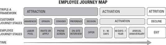
We will build this map together. This figure shows three different ways of categorizing the stages that all employees go through in their relationship with a company.
In the figure, the first row is included so you can see how the detailed employee journey stages found below fit into the over-arching triple-A framework. The second row expresses the cognitive stages that an employee goes through, borrowing from how a marketer thinks about a customer moving from no awareness of a product to having a relationship with the product, until eventual decline. The third row lines it all up with the activities that occur in the recruiting process. The arrow below shows that the map works left to right, showing how a person moves from no awareness of the company to becoming a productive member of the company to eventual decline.
As the figure illustrates, the employee journey map should accommodate the entire journey that people make as employees — from their first contact with the company during the recruiting process to new-hire orientation to onboarding to the first 30, 90, and 180 days to the first anniversary and on to future anniversaries until the point of exit.
Your recruiting process or way of framing the employee experience in stages may be a little different from mine and that is fine. You can draw your map how you want to — the one I have included is just a generic example.
Employee journey map: the second step is to add the company touchpoints.
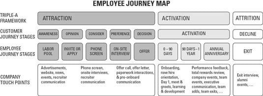
This figure builds on the foundation we’ve started by citing the important company touchpoints that align to each stage.
As I have sampled in the figure, your next step is to brainstorm all of the points of contact between the company and the person to clarify the opportunities you have to influence the opinion of the candidate or employee about the company. By connecting touch points to the employee journey map, you can figure out where your best opportunities are to apply resources to make the most impact on opinion at any given phase of the employee journey.
The next step is to indicate how you are going to measure company performance at each stage. Surveys help you see the journey map beyond merely aspiration and anecdote. With survey data, you can measure each stage of the employee journey in such a way that you can see the average, the range, and trend over time, compared by segment and by stage. Survey data allows you to record incidents and attitudes along the way to see how incidents and attitudes that you find at prior stages correlate to what you find at later stages. With this information, you can focus on improving the experiences at earlier stages that you know are important because of the long-term consequences for the company. Well-designed surveys, when used together with other data, can help you see many things that you otherwise would be unable to see.
Employee journey map: the third step is to decide how you are going to measure each stage.
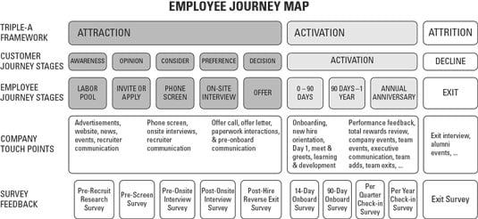
This figure adds the names of the surveys you can use to obtain a quantitative measure of the attitude or opinion of people at each stage.
The figure provides a generic title for a series of surveys you can use to obtain feedback on each stage. I provide some sample surveys later in this chapter. but keep in mind that you can name your surveys whatever you like and modify your surveys as you like — again, what you find here is merely an example to show how it all fits together.
Employee journey map: you can also use data from systems.
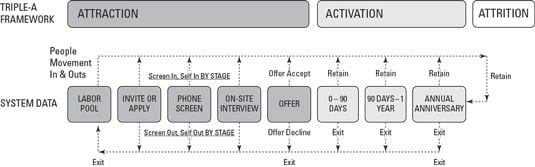
The data you can use in conjunction with your employee journey map is not limited to survey data only. The data blueprint shown a conceptual diagram of what’s happening in the employee journey which, with a little work, can be expressed as metrics using data that you can obtain from systems. Unlike the data described above that is collected through surveys, this type of data is obtained from the applicant tracking system (ATS) or human resource information system (HRIS). After detailed data has been extracted from these systems, you can express the counts of the number of people at each stage, the number of people entering and exiting each stage, and the movement of people between stages in many different useful ways.
The figure illustrates diagrammatically how people move from one stage to the next (or exit out entirely) and provides the names of the base measures that can be used to count and measure the volume of movement. You may use these base measures alone or together with other data to paint a picture of what is happening overall — a picture which cannot be gained by relying on personal experience or anecdotal evidence.
A sample employee journey map.
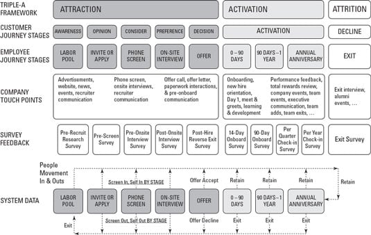
As you can see, the employee journey map allows you to see in one place how a lot of different concepts fit together as one — this is in fact the entire point! The example I have included works left to right and has rows that allow you to see how the triple-A framework, customer journey stages, employee journey stages, company touchpoints, survey feedback tools, and system feedback tools all fit together.
A detailed employee journey map like this one should definitely be available for use by anyone on the HR team and should be collectively reviewed from time to time, but I’ll admit it is a tad overwhelming to look at if you were not the one involved in creating it. This does not mean you should not do an employee journey map — don’t throw out the baby with the bath water — but you can put the detail away for use by those people who need it when they need it and just provide a summary to the casual audience.
A slimmed-down employee journey map.
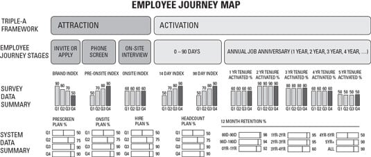
This figure is an example of what the employee journey map could look like with less detail on its inner operations while still including summary data that can be obtained from survey and system sources.
Check out what’s been added. On the Survey Data Summary row, you can review the height of any bar all the way across to compare stages to each other. There are four bars for each stage, which represent a quarterly view so you can also see if you are getting better over time. Because this is just illustrative, my labelling is not specific (Q1, Q2, Q3, Q4), but in your case you could be more specific: for example: Q1-2018, Q2-2018, Q3-2018, Q4-2018. You also could report it by intervals other than quarters — bi-annually or annually, for example. The point of the design I have suggested here is that you can compare stages to each other and also see how each stage is changing over time in a single glance.
The bottom row, labelled System Data Summary, is just there to illustrate that you can also include system data facts and/or leverage graphs of a different design, as necessary for your situation. In the example I have illustrated here, the focus of the graphs is not on the absolute volume of activity by stage (difficult to interpret), but rather on a metric that compares the volume of activity to what was planned in advance — the metric expressed is essentially the percentage of plan achieved for key stages. These bars can range between 0 and 100 (with 100 being perfect) and the line indicates how close the company got to plan. Again, I have added bars labelled by quarter so you if this were real data you could see how the company is improving over time — or not. You could also see how missing the plan in earlier stages can quickly add up to a situation where you miss plan in later stages. This design allows you to quickly trace the problem back to where it started.
The graphs on the far right of the bottom row are different than the ones to the left. The graphs to the far right represent the percentage of employees retained (the ones that didn’t leave the company) over a 12-month period by job tenure group. If this were real data, these graphs would show you at what point or points in the employee’s job tenure you begin to see high percentages of employees exit the company. Seeing retention in 1-year job tenure intervals allows you to find the right time frames to move employees into new jobs, address whatever the problems are common among each tenure interval which may be different than exits among other tenure intervals, and plan for inevitable exits.
The intent of the graphs included in this chapter is not to convey a real data insight or to explain how to create them. These are sketchy examples with fake data. My goal here is to show you that, with a handful of graphs, you can create a powerful dashboard that can be easily understood in the context of the employee journey with a quick glance — this does not occur by accident, this occurs by design.