Because data miners lean heavily on basic graphs, some data-mining applications offer little or nothing more. Others provide a wide range of graph options, from the common to the exotic. It’s not necessary to use all of these, but you may benefit by selecting and using a few that suit your own needs. Data miners often use these graphs:
Boxplot (also called box and whiskers)
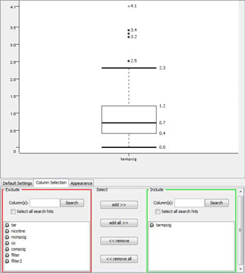
Histograms describe distributions of continuous variables, but have limited value for showing details. A boxplot is an alternative. The heart of the image is a box; this represents half of the data, taken in the middle of its range.
The center of the box is the median value of the variable, and the lower and upper ends of the box represent the 25th- and 75th-percentile levels, respectively. Whiskers extend below and above the box, representing the range of the bulk of the data. Points beyond the whiskers are taken to be outliers, highly atypical values (some plots also indicate extremes, which are outliers among outliers).
Conditional boxplot
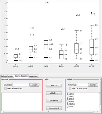
Boxplots for several groups (such as geographic regions) can be placed side by side on a single graph for easy comparison.
Parallel coordinates
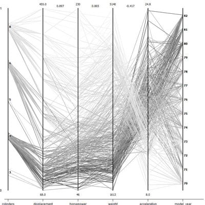
The plots show values for several variables all together on a single plot, with the values for each case connected by line segments. Common combinations stand out from the rest. For example, the figure shows several variables related to cars and fuel consumption.
Many cases share certain values, exactly or approximately, forming dark patterns from the many lines following similar paths across the graph. For example, cases for cars with four cylinders, low displacement, high mileage, and late model years form a very dark and conspicuous pattern.
Gains charts (also called cumulative gains)
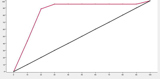
A gains chart shows you how much a predictive model improves results over random sampling. Some people are more likely to take action (buy a product, vote for a candidate, break the law . . . ) than others. If you know nothing about a group of people, the best you can say is that contacting half of the people will turn up half of those who will take action.
But a predictive model can tell you which people are the best prospects, so you can use the model to pick half (or 10 percent or 60 percent, and so on . . . ) and get more action. How much more?
In the chart, you can see a diagonal line where the x and y values are always the same; this represents what you’d get by selecting prospects at random. The other line represents the model. The difference in y values between the model and the random selection shows how much the model improves your outcome. Read the model line plotted on the chart, and compare it to the line for random sampling.
Lift charts
Lift charts are very similar to gains charts. The key difference is that the data is normalized, so that random sampling is always represented as a value of 1 and model results are shown in proportion to random sampling.
You may see several different types of charts called lift charts. Some are cumulative, and others are not. Some may even be gains charts