
You need only a handful of tools to determine the dominant trend or phase of the market and these can help you know when trading is a good idea. Significant changes in the markets happen slowly and thus show up better in weekly charts than they do in daily charts because insignificant changes are filtered out.
Traders typically monitor charts of the major indexes such as the S&P 500 (SPX) or the NASDAQ Composite Index (COMPX). Doing so makes visually identifying bull markets and bear markets easy. They appear as trends. A bull market appears as a series of higher highs and higher lows on weekly index charts. A bear market appears as a series of lower highs and lower lows. These are the dominant trends.
Pullback patterns, such as the flag, pennant, and other retracement patterns, correspond to the bullish pullback and bearish pullback conditions. And bullish transition and bearish transition phases may signal a trend reversal in much the same way that reversal patterns and trading ranges often lead to a change in direction.
This weekly chart of NASDAQ Composite Index reflects a bull market. The weekly chart of NASDAQ Composite Index below reflects a bear market.
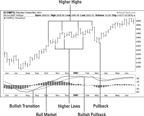
Most trend identification tools apply to these weekly charts. For example, you can easily spot the higher highs and higher lows that occurred in late 2006. These higher highs and higher lows correspond to a bull market. You also can easily see the lower highs and lower lows; they accompanied the long-running bear market.
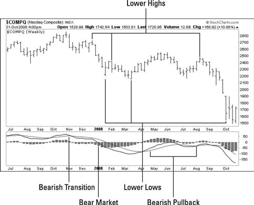
You also need to be able to identify the moving average convergence divergence (MACD) crossover points and divergent patterns on these charts. MACD signals provide you with additional information to augment the way you categorize current phases of the market.
You can create this index chart at StockCharts.com by clicking on the tab for FreeCharts and then putting NASDAQ Composite ($COMPQ) in the box labeled Create a Sharp Chart. At the top of the chart, set the period to weekly. Then at the bottom of the chart, set the Chart Attributes as follows: HLC Bars, no overlays, and MACD Indicator with parameters 12, 26, 9 below the chart.
Using MACD to indicate bull and bear markets is straightforward:
A bull market is indicated when the MACD line is greater than the zero line and greater than the trigger line.
A bear market is indicated when the MACD line is less than the zero line and less than the trigger line.
However, pullback and transition phases are not as clearly defined:
Either a bullish transition — or a bearish pullback — is indicated when the MACD line is less than the zero line and it crosses above the trigger line.
Either a bearish transition — or a bullish pullback — is indicated when the MACD is greater than the zero line and it crosses below the trigger line.
Use the bullish percent index (BPI) in conjunction with pattern analysis to help distinguish between the transition and pullback phases.
You can see where the MACD indicator on the weekly chart is less than zero and crosses above its trigger line. When the MACD crossed above its trigger line, it suggested the market may have been trying to turn from a bear market to a bull market in a bullish transition phase.
You can see two instances where the MACD signaled these bearish pullbacks or bullish transitions in 2008. Both failed, resulting in a dramatic continuation of the bear market.