You can see an example of a candlestick below. Each bar represents the price of Apple Inc. for a specific day.
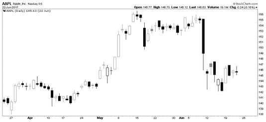 Chart courtesy of StockCharts.com
Apple Inc. candlesticks.
The important distinction is that the body of the candle reflects what happened during the day:
- If it is hollow, the close was higher than the open. If it is filled in, the closing price was lower than when the markets opened.
- On a hollow candle, the close is shown at the top of the body of the candle. On a filled-in candle, the close is shown at the bottom of the body of the candle. If the close is roughly the same as the open, the candle will appear to have no body, like on Apple’s chart for May 2. This candle shape is called a doji.
The candle body
When looking at the body of the candlestick, pay close attention to the components as well as the shapes of the candles.Candlestick components
Each candle body has several components. These components provide various pieces of information:- The opening price in the morning
- The closing price at the end of the day
- The difference between the two prices, which is the body
- Hollow candle moved higher through the day
- Filled candle moved lower through the day
- The highest price of the day, shown by the top shadow (the upper “wick”)
- The lowest price of the day, indicated by the lower shadow (the lower “wick”)
Candlestick shapes
The body of the candle tells you whether the market improved or fell during the day. Its appearance gives you a feel for the price action throughout the day. You can visualize these differences in the candlestick shapes:- A long, hollow body suggests the price moved up significantly in a single day, with buying pressure pushing it aggressively higher. (1)
- A line across the middle of the shadow, referred to as a doji, means the market opened and closed at or near the same level, usually meaning the market is balanced at that price. (3)
- A small, filled candle suggests the market was soft that day without a lot of momentum. (4)
- A large, filled candle suggests selling pressure was evident as the price moved significantly lower. (5)
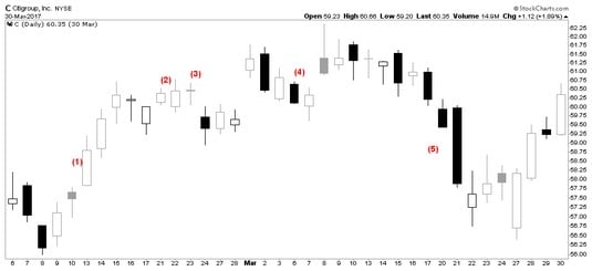 Chart courtesy of StockCharts.com
Candlestick shapes.
Shadows on a hollow candle
The size of each shadow shows you how far the price moved away from the two key times of the day, the open and the close. You can see the differences in shadows below. The shadows, or wicks, mean different things on a hollow body of the candle:- Long shadows above a hollow candle suggest very little support at the higher level. Bearish. (A bear market is a market in which stock prices are falling. People holding stock tend to begin selling stock.) (1)
- Short shadows above a hollow body suggest the high was near to the close. Bullish. (A bull market is a market in which stock prices are rising. People tend to buy stock in this type of market.) (2)
- No shadow above means the price climbed all day and closed at the highest price of the day. Very bullish. (3)
- Small shadows below a hollow body mean the price tested slightly lower but then went up past the open to close at a higher level. Bullish. (4)
- Long shadows below a hollow body mean the price moved significantly lower during the day, but then buyers came in and pushed the price back up above the open. Bullish. (5)
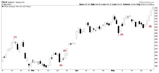 Chart courtesy of StockCharts.com
Shadows on hollow candles.
Shadows on a filled candle
The size of each wick shows you how far the price moved away from the two key times of the day, the open and the close. The shadows mean different things on a filled body of the candle. Shadow differences on filled candles are shown below:- Long shadows above a filled-in body suggest very little support at the higher level. The price traded higher during the day and then dropped and fell below the open to close down on the day. Bearish. (1)
- Short shadows above a filled body suggest the price tried to go higher after the open but then traded down, moved below the open, and closed down from there. Bearish. (2)
- Little or no shadow above means the price opened and fell all day. The close was below the opening price of the day and couldn’t go higher. Bearish. (3)
- Small shadows below a filled body mean the price closed near the lows of the day. Bearish. (4)
- Long shadows below a filled-in body mean the price moved significantly lower during the day. Buyers then came in and pushed the price back up significantly but not above the opening price for the day. Buyers stepping in and reversing the price back up is bullish. (5)
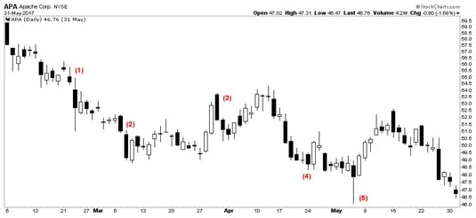 Chart courtesy of StockCharts.com
Shadows on filled candles.