
Excel 2013 lets you spruce up a worksheet with a whole bevy of graphics, including sparklines (new tiny charts that fit right inside worksheet cells), text boxes, clip art drawings supplied by Microsoft, as well as graphic images imported from other sources, such as digital photos, scanned images, and pictures downloaded from the Internet.
In addition to these graphics, Excel 2013 supports the creation of fancy graphic text called WordArt as well as a whole bevy of organizational and process diagrams known collectively as SmartArt graphics.
Spark up the data with sparklines in Excel 2013
Excel 2013 supports a special type of information graphic called a sparkline that represents trends or variations in collected data. Sparklines are tiny graphs generally about the size of the text that surrounds them. In Excel 2013, sparklines are the height of the worksheet cells whose data they represent and can be any of the following chart types:
Line that represents the relative value of the selected worksheet data
Column where the selected worksheet data is represented by tiny columns
Win/Loss where the selected worksheet data appears as a win/loss chart; wins are represented by blue squares that appear above red squares (representing the losses)
Sparklines via the Excel 2013 Quick Analysis tool
In Excel 2013, you can use the new Quick Analysis tool to quickly add sparklines to your data. All you have to do is select the cells in the worksheet to be visually represented, click the Quick Analysis tool followed by Sparklines on its options palette. This displays buttons for the three types of sparklines: Line, Column, and Win/Loss.
To preview how your data looks with each type of sparklines, highlight the button in the palette with the mouse pointer or Touch Pointer. Then, to add the previewed sparklines to your worksheet, simply click the appropriate Sparklines button.
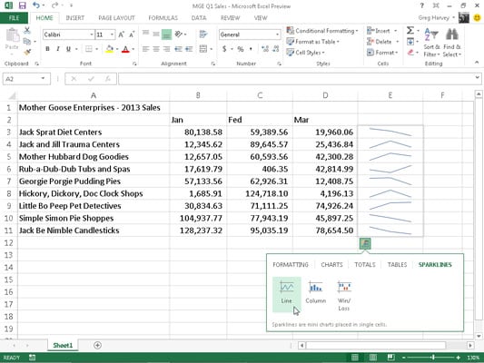
You can see the sample Mother Goose Enterprises worksheet with the first quarter sales after the cell range B3:D11 has been selected and then opened the Sparklines tab in the Quick Analysis tool’s palette. Excel immediately previews line-type trendlines in the cell range E3:E11 of the worksheet. To add these trendlines, all you have to do is click the Line option in the tool’s palette.
Sparklines from the Excel 2013 Ribbon
You can also add sparklines the good old-fashioned way using the Sparklines command buttons on the Insert tab of the Ribbon. To manually add sparklines to the cells of your worksheet:
Select the cells in the worksheet with the data you want to represent with sparklines.
Click the chart type you want for your sparklines (Line, Column, or Win/Loss) in the Sparklines group of the Insert tab or press Alt+NSL for Line, Alt+NSO for Column, or Alt+NSW for Win/Loss.
Excel opens the Create Sparklines dialog box containing two text boxes:
Data Range: Shows the cells you select with the data you want to graph.
Location Range: Lets you designate the cell or cell range where you want the sparklines to appear.
Select the cell or cell range where you want your sparklines to appear in the Location Range text box and then click OK.
When creating sparklines that span more than a single cell, the number of rows and columns in the location range must match the number of rows and columns in the data range. (That is, the arrays need to be of equal size and shape.)
Because sparklines are so small, you can easily add them to the cells in the final column of a table. That way, the sparklines can depict the data visually and enhance meaning while being an integral part of the table.
How to format sparklines
After you add sparklines to your worksheet, Excel 2013 adds a Sparkline Tools contextual tab with its own Design tab to the Ribbon that appears when the cell or range with the sparklines is selected.
This Design tab contains buttons that edit the type, style, and format of the sparklines. The final group on this tab enables you to band a range of sparklines into a single group that can share the same axis and/or minimum or maximum values. This is useful when you want a collection of sparklines to share the same charting parameters so that they represent the trends in the data equally.
You can’t delete sparklines from a cell range by selecting the cells and then pressing the Delete button. Instead, to remove sparklines, right-click their cell range and select Sparklines→Clear Selected Sparklines from its context menu.