How to create a histogram
To make a histogram, you first divide your data into a reasonable number of groups of equal length. Tally up the number of values in the data set that fall into each group (in other words, make a frequency table). If a data point falls on the boundary, make a decision as to which group to put it into, making sure you stay consistent (always put it in the higher of the two, or always put it in the lower of the two). Make a bar graph, using the groups and their frequencies — a frequency histogram.If you divide the frequencies by the total sample size, you get the percentage that falls into each group. A table that shows the groups and their percents is a relative frequency table. The corresponding histogram is a relative frequency histogram.
You can use Minitab or a different software package to make histograms, or you can make your histograms by hand. Either way, your choice of interval widths (called bins by computer packages) may be different from the ones seen in the figures, which is fine, as long as yours look similar. And they will, as long as you don’t use an unusually low or high number of bars and your bars are of equal width.
You may also choose different start/end points for each interval, and that’s fine as well. Just be sure to label everything clearly so your instructor can see what you’re trying to do. And be consistent about values that end up right on a border; always put them in the lower grouping, or always put them in the upper grouping. If you do have a choice, however, make your histograms by using a computer package like Minitab. It makes your task much easier.See the following for an example of making the two types of histograms.
Test scores for a class of 30 students are shown in the following table.
| Scores | Frequency |
| 70–79 | 8 |
| 80–89 | 16 |
| 90–99 | 6 |
The frequency histogram for the scores data is shown in the following figure.
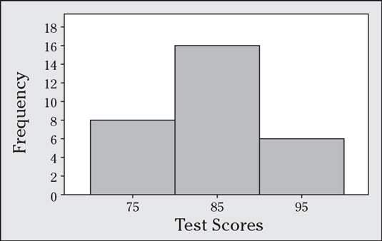
You find the relative frequencies by taking each frequency and dividing by 30 (the total sample size). The relative frequencies for these three groups are 8 / 30 = 0.27 or 27%; 16 / 30 = 0.53 or 53%; and 6 / 30 = 0.20 or 20%, respectively.
A histogram based on relative frequencies looks the same as the histogram (of the same data). The only difference is the label on the Y-axis.
Making sense of histograms
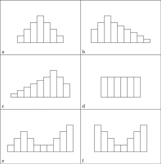
A histogram gives you general information about three main features of your quantitative (numerical) data: the shape, center, and spread.The shape of a histogram is shown by its general pattern. Many patterns are possible, and some are common, including the following:
- Bell-shaped: Looks like a bell — a big lump in the middle and tails that go down on each side at about the same rate. (Figure a)
- Right skewed: A big part of the data is set off to the left, with a few larger observations trailing off to the right. (Figure b)
- Left skewed: A big part of the data is set off to the right, with a few smaller observations trailing off to the left. (Figure c)
- Uniform: All the bars have a similar height. (Figure d)
- Bimodal: Two peaks, or (Figure e)
- U-shaped: Bimodal with the two peaks at the low and high ends, with less data in the middle. (See Figure 4-1 (Figure f)
- Symmetric: Looks the same on each side when you split it down the middle; bell-shaped, uniform, and U-shaped histograms are all examples of symmetric data. (Figures a, d, and f)
 Histograms have several common patterns.
You can view the center of a histogram in two ways. One is the point on the x-axis where the graph balances, taking the actual values of the data into account. This point is called the average, and you can find it by locating the balancing point (imagine the data are on a teeter-totter). The other way to view center is locating the line in the histogram where 50 percent of the data lies on either side. The line is called the median, and it represents the physical middle of the data set. Imagine cutting the histogram in half so that half of the area lies on either side of the line.
Spread refers to the distance between the data, either relative to each other or relative to some central point. One crude way to measure spread is to find the range, or the distance between the largest value and the smallest value. Another way is to look for the average distance from the middle, otherwise known as the standard deviation. The standard deviation is hard to come up with by just looking at a histogram, but you can get a rough idea if you take the range divided by 6. If the heights of the bars close to the middle seem very tall, that means most of the values are close to the mean, indicating a small standard deviation. If the bars appear short, you may have a larger standard deviation.
You can do actual summary statistics to calculate the quantitative data, but a histogram can give you a general direction for finding these milestones. And like pie charts and bar graphs, not all histograms are fair, complete, and accurate. You have to know what to look for to evaluate them.
How to straighten out skewed data with histograms
You need to make special considerations for skewed data sets, in terms of which statistics are the most appropriate to use and when. You should also be aware of how using the wrong statistics can provide misleading answers.You can relate the mean and median to learn about the shape of your data. Having the mean and median close to being equal will create a shape that is roughly symmetric
The mean is affected by outliers in the data, but the median is not. If the mean and median are close to each other, the data aren’t skewed and likely don’t contain outliers on one side or the other. That means that the data look about the same on each side of the middle, which is the definition of symmetric data (see a, d, or f in the preceding figure).
The fact that the mean and median being close tells you the data are roughly symmetric can be used in a different type of test question. Suppose that someone asks you whether the data are symmetric, and you don’t have a histogram, but you do have the mean and median. Compare the two values of the mean and median, and if they are close, the data are symmetric. If they aren’t, the data are not symmetric.