
U.S. Commercial Space Revenues 1990–1994 (In Millions of Dollars)
| Industry | 1990 | 1991 | 1992 | 1993 | 1994 |
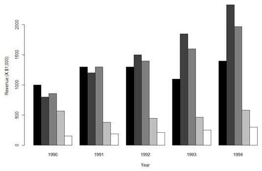
| Commercial Satellites Delivered | 1,000 | 1,300 | 1,300 | 1,100 | 1,400 |
| Satellite Services | 800 | 1,200 | 1,500 | 1,850 | 2,330 |
| Satellite Ground Equipment | 860 | 1,300 | 1,400 | 1,600 | 1,970 |
| Commercial Launches | 570 | 380 | 450 | 465 | 580 |
| Remote Sensing Data | 155 | 190 | 210 | 250 | 300 |

If you had to make a presentation about these data, you'd agree that your audience would prefer the graph to the table. Although the table is informative, it doesn't hold people's attention. It's easier to see trends in the graph — Satellite Services rose fastest while Commercial Launches stayed fairly level, for example.
This graph is called a grouped bar plot. How do you create a plot like this one in base R?
The first thing to do is create a vector of the values in the cells:
rev.values <-
c(1000,1300,1300,1100,1400,800,1200,1500,1850, 2330,860,1300,1400,1600,1970,570,380,450,465,580, 155,190,210,250,300)
Although commas appear in the values in the table (for values greater than a thousand), you can't have commas in the values in the vector! (For the obvious reason: Commas separate consecutive values in the vector.)
Next, you turn this vector into a matrix. You have to let R know how many rows (or columns) will be in the matrix, and that the values load into the matrix row-by-row:space.rev <- matrix(rev.values,nrow=5,byrow = T)
Finally, you supply column names and row names to the matrix:
colnames(space.rev) <-
c("1990","1991","1992","1993","1994")
rownames(space.rev) <- c("Commercial Satellites Delivered","Satellite Services","Satellite Ground Equipment","Commercial Launches","Remote Sensing Data")
Have a look at the matrix:
> space.rev
......... ....1990 1991 1992 1993 1994
Commercial Satellites Delivered 1000 1300 1300 1100 1400
Satellite Services 800 1200 1500 1850 2330
Satellite Ground Equipment 860 1300 1400 1600 1970
Commercial Launches 570 380 450 465 580
Remote Sensing Data 155 190 210 250 300
Perfect. It looks just like the table.
With the data in hand, you move on to the bar plot. You create a vector of colors for the bars:
color.names = c("black","grey25","grey50","grey75","white")
A word about those color names: You can join any number from 0 to 100 with "grey" and get a color: "grey0" is equivalent to "black" and "grey100" is equivalent to "white". (Far more than fifty shades, . . . )
barplot(space.rev, beside = T, xlab= "Year",ylab= "Revenue (X $1,000)", col=color.names)
beside = T means the bars will be, well, beside each other. (You ought to try this without that argument and see what happens.) The col = color.names argument supplies the colors you specified in the vector.
The resulting plot is shown here.
What's missing, of course, is the legend. You add that with the legend() function to produce the figure:
> legend(1,2300,rownames(space.rev), cex=0.7, fill = color.names, bty = "n")
The first two values are the x- and y-coordinates for locating the legend. (That took a lot of tinkering!). The next argument shows what goes into the legend (the names of the industries). The cex argument specifies the size of the characters in the legend. The value, 0.7, indicates that you want the characters to be 70 percent of the size they would normally be. That's the only way to fit the legend on the graph. (Think of "cex" as "character expansion," although in this case it's "character contraction.") fill = color.names puts the color swatches in the legend, next to the row names. Setting bty (the "border type") to "n" ("none") is another little trick to fit the legend into the graph.