The most common plots used to graph two-variable data sets are the scatter plot and the xy-line plot. You can create both of these on the TI-84 Plus calculator.
The scatter plot plots the points (x, y), where x is a value from one data list (Xlist) and y is the corresponding value from the other data list (Ylist). The xy-line plot is simply a scatter plot with consecutive points joined by straight segments.
To construct a scatter plot or an xy-line plot, follow these steps:
Enter your data in the calculator.
See the first screen. Your list does not have to appear in the Stat List editor to plot it, but it does have to be in the memory of the calculator.
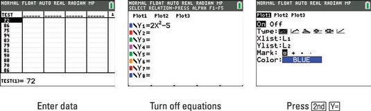
Turn off any Stat Plots or functions in the Y= editor that you don’t want to be graphed along with your histogram.
To do so, press [Y=] to access the Y= editor. The calculator graphs any highlighted plots in the first line of this editor. To remove the highlight from a plot so that it won’t be graphed, use the arrow keys to place the cursor on the plot and then press [ENTER] to toggle the plot between highlighted and not highlighted.
The calculator graphs only those functions in the Y= editor defined by a highlighted equal sign. To remove the highlight from an equal sign, use the arrow keys to place the cursor on the equal sign in the definition of the function, and then press [ENTER] to toggle the equal sign between highlighted and not highlighted. See the second screen.
Press [2nd][Y=] to access the Stat Plots menu and enter the number (1, 2, or 3) of the plot you want to define.
The third screen shows this process, where Plot1 is used to plot the data.
Highlight On.
If On is highlighted, the calculator is set to plot your data. If you want your data to be plotted at a later time, highlight Off. To highlight an option, use the arrow keys to place the cursor on the option, and then press [ENTER].
Press the down-arrow key, use the right-arrow key to place the cursor on the type of plot you want to create, and then press e to highlight it.
Select the icon that looks like a corner with random dots to construct scatter plot as shown in the first screen.
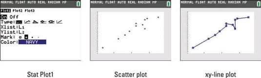
Enter the name of your Ylist and press [ENTER].
Choose the type of mark used to plot points.
You have four choices: a large empty square, a small plus sign, a small square, or a dot. To select one, use the right-arrow key to place the cursor on the mark, and press [ENTER].
Press [ZOOM][9] to plot your data using the ZoomStat command.
ZoomStat finds an appropriate viewing window for plotting your data. The second screen in shows a scatter plot, and the third screen is an xy-line plot.