What is bounce lettering?
Bounce lettering is a style of handwriting that is often seen on DIY projects or Pinterest on pallet wood signs, invitations, bullet journals, and beyond. It is often associated with modern calligraphy or brush lettering because of the embellishments that are added to the letters. The flourishes given to the writing almost makes the letters seem as though they are bouncing around. This fun form of writing is a great way to put your own creative juices to work!Now for the technical details.
Before you can learn to do bounce lettering, you need to understand the mechanics of writing. Do you remember those handwriting tablets that you recall from your childhood? They look like this:
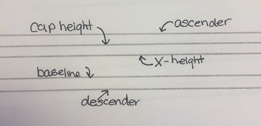
Here’s what all those lines are used for:
- Baseline: As the name implies, this line is the base for your letters. This line is used to keep your letters straight and in line with one another. All letters sit on this line unless they have a descending line.
- Cap height: This line provides structure to your letters by keeping them contained, so to speak. This is how writers determine how tall letters should be. Similar to the baseline, this line is the guide for where letters should stop on the top.
- X-height: The x-height line is the dashed line you see on handwriting paper. This is to help writers learn the appropriate height for lowercase letters. At least, those without an ascending line.
- Ascender: Traditionally, the ascender line was used to guide those letters that have vertical lines, like the letter k and b. However, some people simply use the cap height line as their guide for where these vertical lines should stop. Either form is acceptable.
- Descender: The descender line is used to denote the stopping point for letters with descending lined, such as the letter p.
If you are new bounce lettering, brush lettering or calligraphy are good forms to practice before diving in.
How to do bounce lettering
So, now that you are briefed on the technicalities of writing, it’s time to break all the rules. That’s right. Bounce lettering is all about breaking the rules and making your writing appear whimsical, rather than perfect. To do this, you will write your script by going outside of the lines described above. Embrace the freedom of not staying where you are supposed to write.There are no prescribed rules for how to do bounce lettering. The idea is to experiment until you land on writing that you enjoy and that seems to bounce all over the page. However, if you want some tips for getting started, heed the following tips:
- Resist the impulse of having the bottom of your letters rest on the baseline.
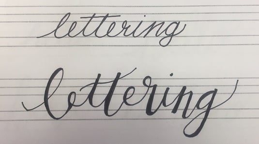
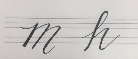
- Let your downstrokes go below the descender line. An m or h can go below that sneaky line that usually keeps things straight.
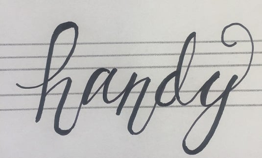
- Allow letters to go beyond their normal x-height. For example, the uppermost points of a w would all be even on the x-height line. For bounce lettering, extend the tops of the w beyond the x-height line.
- Don’t be afraid to add flourishes to cross strokes and downstrokes (the cross on a t).
- Vary the heights of the bottommost parts of your letters that have two or more downward strokes. For example, when writing an n or h, you will want the bottom lines to not be even with one another.
- Emphasize loops in letters. For example, you could allow the loop in the upstroke on an h to be a little more pronounced than normal.
- And the most important tip: practice. Play around with your letters to find a style that you like.