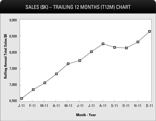
When developing a strategic plan, you need a dynamic way to look at your performance month after month because you’d like to see whether you’re growing or shrinking. The Trailing 12 Months (T12M) chart, developed by Kraig Kramers — founder of CEO Tools — can help you track monthly sales for your last 12 months. T12M charts graphically tell you whether you’re improving or slipping.
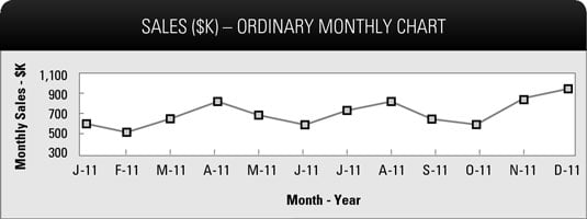
Take a look at the example figures. The first is an ordinary monthly chart. This type of chart is often misleading and shows little other than seasonality.
On the other hand, the next figure (a T12M) shows a true trend line on sales, gross profits, or whatever key data you use these charts to track.
Ready to create your T12M? Open a new Excel spreadsheet and follow these steps:
Label Column A “Month/Year” and list the months in chronological order, starting with the oldest date first.
For example, label January 2011 as J-11, February 2011 as F-11, and so on.
Label Column B “Monthly Sales” and enter the monthly sales for each corresponding month.
In the J-11 column, enter your January sales. In the F-11 column, enter your February sales, and so on.
Label Column C “TTM Sales” and add the first month’s sales to the second month’s sales in the same row next to the second month’s sales.
Move down one row; add the sum above it (the first two months) to the sales in month three. This number is a simple 12-month sum that moves forward one month (and down one row) at a time. You’re adding the current month to the running total in the row above.
Select Insert and then click Line Chart.
Use the line chart to graph Column C. You should see a trend line going up or down similar to that in the figure.
Evaluate your T12M chart.
If your trend line is going up month to month, that indicates positive performance. If your trend line is going down, that means you’re performing worse than in previous months.
For additional information on the tool, check out Kraig Kramers’s website, where you can print a version with a full explanation. (Click New Tools Catalog, scroll down to Trailing 12-Month Chart, and click the PDF symbol to bring it up on your screen and print it.)
By watching your T12M month to month, you can immediately see whether you need to take corrective action and when. If your trend line is moving upward, that means keep on doing what you’re doing — growing!