To give you an idea of how the Central Limit Theorem works, there is a simulation. This simulation creates something like a sampling distribution of the mean for a very small sample, based on a population that’s not normally distributed. As you’ll see, even though the population is not a normal distribution, and even though the sample is small, the sampling distribution of the mean looks quite a bit like a normal distribution.
Imagine a huge population that consists of just three scores — 1, 2, and 3 — and each one is equally likely to appear in a sample. Imagine also that you can randomly select a sample of three scores from this population.
| Sample | Mean | Sample | Mean | Sample | Mean |
| 1,1,1 | 1.00 | 2,1,1 | 1.33 | 3,1,1 | 1.67 |
| 1,1,2 | 1.33 | 2,1,2 | 1.67 | 3,1,2 | 2.00 |
| 1,1,3 | 1.67 | 2,1,3 | 2.00 | 3,1,3 | 2.33 |
| 1,2,1 | 1.33 | 2,2,1 | 1.67 | 3,2,1 | 2.00 |
| 1,2,2 | 1.67 | 2,2,2 | 2.00 | 3,2,2 | 2.33 |
| 1,2,3 | 2.00 | 2,2,3 | 2.33 | 3,2,3 | 2.67 |
| 1,3,1 | 1.67 | 2,3,1 | 2.00 | 3,3,1 | 2.33 |
| 1,3,2 | 2.00 | 2,3,2 | 2.33 | 3,3,2 | 2.67 |
| 1,3,3 | 2.33 | 2,3,3 | 2.67 | 3,3,3 | 3.00 |
In the simulation, a score was randomly selected from the population and then randomly select two more. That group of three scores is a sample. Then you calculate the mean of that sample. This process was repeated for a total of 60 samples, resulting in 60 sample means. Finally, you graph the distribution of the sample means.
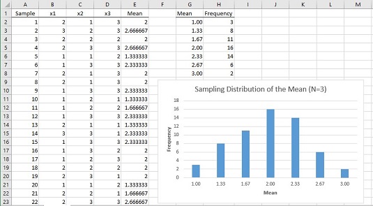
What does the simulated sampling distribution of the mean look like? The image below shows a worksheet that answers this question.
In the worksheet, each row is a sample. The columns labeled x1, x2, and x3 show the three scores for each sample. Column E shows the average for the sample in each row. Column G shows all the possible values for the sample mean, and column H shows how often each mean appears in the 60 samples. Columns G and H, and the graph, show that the distribution has its maximum frequency when the sample mean is 2.00. The frequencies tail off as the sample means get further and further away from 2.00.
The point of all this is that the population looks nothing like a normal distribution and the sample size is very small. Even under those constraints, the sampling distribution of the mean based on 60 samples begins to look very much like a normal distribution.
What about the parameters the Central Limit Theorem predicts for the sampling distribution? Start with the population. The population mean is 2.00 and the population standard deviation is .67. (This kind of population requires some slightly fancy mathematics for figuring out the parameters.)
On to the sampling distribution. The mean of the 60 means is 1.98, and their standard deviation (an estimate of the standard error of the mean) is .48. Those numbers closely approximate the Central Limit Theorem–predicted parameters for the sampling distribution of the mean, 2.00 (equal to the population mean) and .47 (the standard deviation, .67, divided by the square root of 3, the sample size).
In case you’re interested in doing this simulation, here are the steps:
- Select a cell for your first randomly selected number. Select cell B2.
- Use the worksheet function
RANDBETWEENto select 1, 2, or 3. This simulates drawing a number from a population consisting of the numbers 1, 2, and 3 where you have an equal chance of selecting each number. You can either selectFORMULAS | Math & Trig | RANDBETWEENand use the Function Arguments dialog box or just type=RANDBETWEEN(1,3)in B2 and press Enter. The first argument is the smallest number RANDBETWEEN returns, and the second argument is the largest number. - Select the cell to the right of the original cell and pick another random number between 1 and 3. Do this again for a third random number in the cell to the right of the second one. The easiest way to do this is to autofill the two cells to the right of the original cell. In this worksheet, those two cells are C2 and D2.
- Consider these three cells to be a sample, and calculate their mean in the cell to the right of the third cell.
The easiest way to do this is just type
=AVERAGE(B2:D2)in cell E2 and press Enter. - Repeat this process for as many samples as you want to include in the simulation. Have each row correspond to a sample.
AVERAGE and STDEV.P to find its mean and standard deviation.To see what this simulated sampling distribution looks like, use the array function FREQUENCY on the sample means in column E. Follow these steps:
- Enter the possible values of the sample mean into an array. You can use column G for this. You can express the possible values of the sample mean in fraction form (3/3, 4/3, 5/3, 6/3, 7/3, 8/3, and 9/3) like the ones entered into the cells G2 through G8. Excel converts them to decimal form. Make sure those cells are in Number format.
- Select an array for the frequencies of the possible values of the sample mean. You can use column H to hold the frequencies, selecting cells H2 through H8.
- From the Statistical Functions menu, select
FREQUENCYto open the Function Arguments dialog box forFREQUENCY - In the Function Arguments dialog box, enter the appropriate values for the arguments. In the Data_array box, enter the cells that hold the sample means. In this example, that's E2:E61.
- Identify the array that holds the possible values of the sample mean.
FREQUENCYholds this array in the Bins_array box. For this worksheet, G2:G8 goes into the Bins_array box. After you identify both arrays, the Function Arguments dialog box shows the frequencies inside a pair of curly brackets.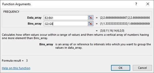
- Press Ctrl+Shift+Enter to close the Function Arguments dialog box and show the frequencies.
Use this keystroke combination because
FREQUENCYis an array function. - Finally, with H2:H8 highlighted, select
Insert | Recommended Chartsand choose the Clustered Column layout to produce the graph of the frequencies. Your graph will probably look somewhat different from mine, because you’ll likely wind up with different random number.