
A ggplot2 geom tells the plot how you want to display your data in R. For example, you use geom_bar() to make a bar chart. In ggplot2, you can use a variety of predefined geoms to make standard types of plot.
A geom defines the layout of a ggplot2 layer. For example, you can use geoms to create bar charts, scatterplots, and line diagrams (as well as a variety of other plots), as you can see below.
Each geom has a default stat, and each stat has a default geom. In practice, you have to specify only one of these.
| Geom | Description | Default Stat |
|---|---|---|
| geom_bar() | Bar chart | stat_bin() |
| geom_point() | Scatterplot | stat_identity() |
| geom_line() | Line diagram, connecting observations in order by x-value | stat_identity() |
| geom_boxplot | Box-and-whisker plot | stat_boxplot() |
| geom_path | Line diagram, connecting observations in original order | stat_identity() |
| geom_smooth | Add a smoothed conditioned mean | stat_smooth() |
| geom_histogram | An alias for geom_bar() and stat_bin() | stat_bin() |
Creating a bar chart
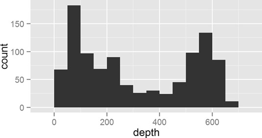
To make a bar chart, you use the geom_bar() function. However, note that the default stat is stat_bin(), which is used to cut your data into bins. Thus, the default behavior of geom_bar() is to create a histogram.
For example, to create a histogram of the depth of earthquakes in the quakes dataset, try:
> ggplot(quakes, aes(x = depth)) + geom_bar()
> ggplot(quakes, aes(x = depth)) + geom_bar(binwidth = 50)
Notice that your mapping defines only the x-axis variable (in this case, quakes$depth). A useful argument to geom_bar() is binwidth, which controls the size of the bins that your data is cut into. This creates this plot.
So, if geom_bar() makes a histogram by default, how do you make a bar chart? The answer is that you first have to aggregate your data, and then specify the argument stat=“identity” in your call to geom_bar().
In the next example, you use aggregate() to calculate the number of quakes at different depth strata:
> quakes.agg <- aggregate(mag ~ round(depth, -1), data = quakes,
+             FUN = length)
> names(quakes.agg) <- c("depth", "mag")
Now you can plot the object quakes.agg with geom_bar(stat=“identity”):
> ggplot(quakes.agg, aes(x = depth, y = mag)) +
+  geom_bar(stat = "identity")
In summary, you can use geom_bar() to create a histogram and let ggplot2 summarize your data, or you can summarize your data and then use stat=“identity” to plot a bar chart.
Making a scatterplot
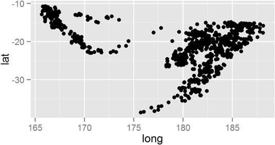
To create a scatterplot, you use the geom_point() function. A scatterplot creates points (or sometimes bubbles or other symbols) on your chart. Each point corresponds to an observation in your data.
You’ve probably seen or created this type of graphic a million times, so you already know that scatterplots use the Cartesian coordinate system, where one variable is mapped to the x-axis and a second variable is mapped to the y-axis.
In exactly the same way, in ggplot2 you create a mapping between x-axis and y-axis variables. So, to create a plot of the quakes data, you map quakes$long to the x-axis and quakes$lat to the y-axis:
> ggplot(quakes, aes(x = long, y = lat)) + geom_point()
This creates this scatterplot.
Creating line charts
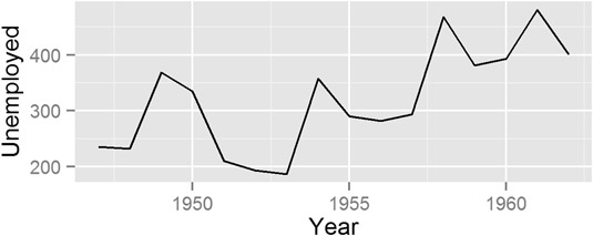
To create a line chart, you use the geom_line() function. You use this function in a very similar way to geom_point(); the difference is that geom_line() draws a line between consecutive points in your data.
This type of chart is useful for time series data in data frames, such as the population data in the built-in dataset longley. To create a line chart of unemployment figures, you use the following:
> ggplot(longley, aes(x = Year, y = Unemployed)) + geom_line()
This creates this line.
You can use either geom_line() or geom_path() to create a line drawing in ggplot2. The difference is that geom_line() first orders the observations according to x-value, whereas geom_path() draws the observations in the order found in the data.