Visualizing hidden groupings in your data
Data clustering is the process of discovering hidden groups of related items within your data. In most cases, a cluster (grouping) consists of data objects of the same type such as social network users, text documents, or emails. One way to visualize the results of a data-clustering model is shown below, where the graph represents social communities (clusters) that were discovered in data collected from social network users.The data about customers was collected in a tabular format; then a clustering algorithm was applied to the data, and the three clusters (groups) were discovered: loyal customers, wandering customers, and discount customers. Assume that the X and Y axis represent the two principal components generated of the original data. Principal component analysis (PCA) is a data reduction technique.
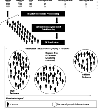
Here the visual relationship among the three groups already suggests where enhanced and targeted marketing efforts might do the most good.
Visualizing data classification results
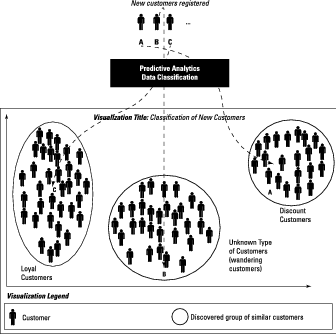
A classification model assigns a specific class to each new data point it examines. The specific classes, in this case, could be the groups that result from your clustering work. The output highlighted in the graph can define your target sets. For any given new customer, a predictive classification model attempts to predict which group the new customer will belong to.After you’ve applied a clustering algorithm and discovered groupings in the customer data, you come to a moment of truth: Here comes a new customer — you want the model to predict which type of customer he or she will be.
The image shows how a new customer’s information is fed to your predictive analytics model, which in turn predicts which group of customers this new customer belongs to. New Customers A, B, and C are about to be assigned to clusters according the classification model. Applying the classification model resulted in a prediction that Customer A would belong with the loyal customers, Customer B would be a wanderer, and Customer C was only showing up for the discount.
Visualizing outliers in your data
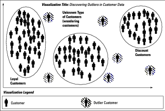
In the course of clustering or classifying new customers, every now and then you run into outliers (special cases that don’t fit the existing divisions).Below, you see a few outliers that don’t fit well into the predefined clusters. Six outlier customers have been detected and visualized. They behave differently enough that the model can’t tell whether they belong to any of defined categories of customers.
Visualization of Decision Trees
Many models use decision trees as their outputs: These diagrams show the possible results from alternative courses of action, laid out like the branches of a tree.The image below shows an example of a tree used as a classifier: It classifies baseball fans based on a few criteria, mainly the amount spent on tickets and the purchase dates. From this visualization, you can predict the type of fan that a new ticket-buyer will be: casual, loyal, bandwagon, diehard, or some other type.
Attributes of each fan are mentioned at each level in the tree (total number of attended games, total amount spent, season); you can follow a path from a particular “root” to a specific “leaf” on the tree, where you hit one of the fan classes (c1, c2, c3, c4, c5).
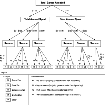
Suppose you want to determine the type of baseball fan a customer is so that you can determine what type of marketing ads to send to the customer. Suppose you hypothesize that baseball fanatics and bandwagon fans can be persuaded to buy a new car when their team is doing well and headed for the playoffs.
You may want to send marketing ads and discounts to persuade them to make the purchase. Further, suppose you hypothesize that bandwagon fans can be persuaded to vote in support of certain political issues. You can send them marketing ads asking them for that support. If you know what type of fan base you have, using decision trees can help you decide how to approach it as a range of customer types.
Visualizing predictions
Assume you’ve run an array of predictive analytics models, including decision trees, random forests, and flocking algorithms. You can combine all those results and present a consistent narrative that they all support. Here confidence is a numerical percentage that can be calculated using a mathematical function. The result of the calculation encapsulates a score of how probable a possible occurrence is.On the x axis, the supporting evidence represents the content source that was analyzed with content-analytics models that identified the possible outcomes. In most cases, your predictive model would have processed a large dataset, using data from various sources, to derive those possible outcomes. Thus you need show only the most important supporting evidence in your visualization.
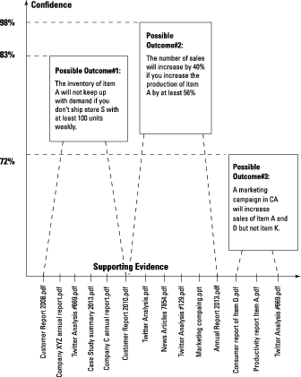
Above, a summary of the results obtained from applying predictive analytics is presented as a visualization that illustrates possible outcomes, along with a confidence score and supporting evidence for each one. Three possible scenarios are shown:
- The inventory of Item A will not keep up with demand if you don’t ship at least 100 units weekly to Store S. (Confidence score: 98 percent.)
- The number of sales will increase by 40 percent if you increase the production of Item A by at least 56 percent. (Confidence score: 83 percent.)
- A marketing campaign in California will increase sales of Items A and D but not Item K. (Confidence score: 72 percent.)
Here the most important supporting evidence consists of how excerpts from several content sources are presented over the x axis. You can refer to them if you need to explain how you got to a particular possible scenario — and trot out the evidence that supports it.
The power behind this visualization is its simplicity. Imagine, after months of applying predictive analytics to your data, working your way through several iterations, that you walk into a meeting with the decision maker. You’re armed with one slide visualization of three possible scenarios that might have a huge impact on the business. Such a visualization creates effective discussions and can lead management to “aha” moments.