
It's great being able to pare down an HTML5 and CSS3 web page so it fits on a mobile device, but obviously if the page is smaller, you'll need more of them. Mobile apps often use a page-flipping metaphor to pack more data in a small piece of screen real estate, and the jQuery mobile library has another wonderful tool to make this easy.
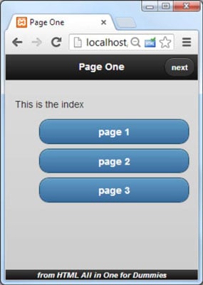
So far, this application looks just like the other jQuery mobile apps you've seen so far. One thing is different, and that's the button in the header. It's very common for mobile apps to have navigation buttons in the header. Press the Next button.
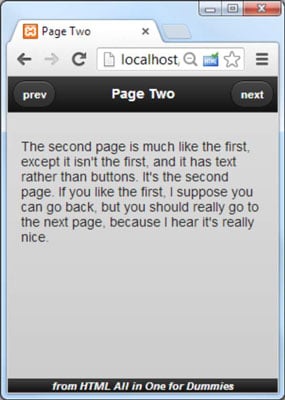
After a nifty fade transition, the next page appears. This one has two buttons in the header. Pressing Next again takes the user to the third page.
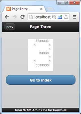
The third page is once again very familiar, but this time it has a single button on the left of the header, and another button in the main content area.
The interesting thing about these three pages is they aren't three pages at all! It's all just one page, designed to act like three different pages. There's a couple of advantages to this arrangement.
CSS and JavaScript resources only need to be loaded once: This keeps the system consistent and improves load times slightly.
There's no lag time: When the document loads, the whole thing is in memory, even if only one part is visible at a time. This allows you to quickly move between pages without having to wait for server access.
You'd normally implement this type of mechanism when you have a large page you want to treat as several smaller pages so the user doesn't have to scroll.
Here's the code for multiPage.html in its entirety.
multiPage.html The second page is much like the first, except it isn't the first, and it has text rather than buttons. It's the second page. If you like the first, I suppose you can go back, but you should really go to the next page, because I hear it's really nice.
from HTML All in One for Dummies
While the code for this example is long, it doesn't break a lot of new ground.
Load up the jQuery mobile content.
Pull in the necessary CSS and JavaScript files from the jQuery.com site.
Apply your own CSS.
Even if you're “borrowing” CSS code from jQuery, you're still allowed to add your own. You can add CSS to make the footer and pre elements act the way you want.
Build your pages.
You can build as many pages as you want, but they all follow the same general jQuery mobile pattern: Create a page div with header, content, and footer divs. Use the data-role attribute to indicate the role of each div.
Name each of the page-level divs with the id attribute.
Because the user will be flipping through the pages, each page needs some sort of identifier. Give each page a unique id attribute.
Build buttons inside the headers.
The only truly new part of this example (aside from the page-flipping itself ) is the buttons in the headers. Skip ahead to the page 2 header, and you'll see something really interesting:
  prev
  Page Two
  next
If you define a link inside an element with the header data-role, that link will automatically become a button. Furthermore, the first such link defined will automatically be placed to the left of the header, and the second will be placed to the right.
Force a single button to the right.
If you want a button to be on the right, add a class to the button:
  Page One
  next
Use internal anchors to skip between pages.
Take a look at the URLs in all the buttons. They begin with a hash, which indicates an internal link inside the document. Remember, though this feels like three different pages to the user, it's really all one big web page.
Experiment with transitions.
Take a careful look at the button on page three:
Go to index
This button has a special data-transition attribute. By default, mobile pages swap with a fade. You can set the transition to slide, slideup, slidedown, pop, fade, or flip. You can also reverse the transition by adding another attribute: data-direction=”reverse”.