There's a very popular approach among HTML5 and CSS3 programmers to building mobile-friendly websites with AJAX, and that's to use an add-on library to jQuery called jQuery Mobile. Jquery Mobile is a powerful combination of JavaScript and CSS code built on top of the library.
The jQuery library works by taking a normal HTML5 page and modifying it in ways that emulate a native look and feel. The code looks a lot like ordinary HTML:
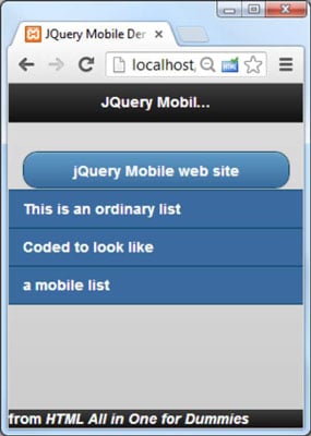
<!doctype html>
<html lang="en">
<head>
 <meta charset="UTF-8">
 <title>Mobile Demo</title>
 <link rel="stylesheet"
  href="http://code.jquery.com/mobile/1.3.1/jquery.mobile-1.3.1.min.css" />
 <script src="http://code.jquery.com/jquery-1.9.1.min.js"></script>
 <script src="http://code.jquery.com/mobile/1.3.1/jquery.mobile-1.3.1.min.js">
 </script>
</head>
<body>
 <div data-role = "page" data-theme = "b">
 <div data-role = "header" data-position = "fixed">
  <h1>JQuery Mobile Demo</h1>
 </div>
 <div data-role = "content">
  <p>
  <a href = "http://jquerymobile.com/"
   data-role = "button">jQuery Mobile website</a>
  </p>
  <ul data-role = "listview">
  <li>This is an ordinary list</li>
  <li>Coded to look like</li>
  <li>a mobile list</li>
  </ul>
 </div>
 <div data-role = "footer" data-position = "fixed">
  from <em>HTML All in One for Dummies</em>
 </div>
 </div>
</body>
</html>
A few details turn this page into a mobile wonder:
Include the jQuery mobile CSS.
This is a special CSS file designed to transform HTML elements into their mobile counterparts. Although you can download it yourself, most developers link straight to the jQuery site.
Include the standard jQuery library.
Much of the code is based on jQuery, so integrate the jQuery library as well. Once again, you need to pull jQuery from the main jQuery website.
Incorporate the jQuery mobile library.
This is a JavaScript library that extends the library to add new mobile-specific behavior.
Add a data-role=”page” attribute to the main div.
Create a main div in your page and provide the attribute to it. This is a custom data-role attribute added by jQuery mobile. jQuery looks over the data roles of the various elements and applies style and behavior changes to these elements automatically. Assign your main div the data role page. This tells the browser to treat the entire div as a page.
Specify a data theme.
You can apply a data theme to any element, but you almost always apply a theme to the page. jquery mobile comes with a number of default themes built in, called “a” through “e.” Experiment to find the one you like, or you can build your own with the special mobile version of the ThemeRoller.
Add more divs inside your page.
Add a few more divs inside your page div. Generally you'll have three: header, content, and footer.
Specify the header div with data-role=”header”.
By placing any of your header information inside a div with a “header” data role, you're telling jQuery to treat this element as a mobile header and apply the appropriate styles. The header typically includes an
tag.
Typically you'll specify the header to be fixed with the data-position=”fixed” attribute. This ensures the header will stay in place if the rest of the content is scrolled, which is typical behavior in a mobile application.
Set up a content div.
Add a div with data-role=”content” to set up the main content area of your page. Any of the main body elements of your site should go in this segment.
Any link can be converted to a button.
The standard convention in web apps is to turn links into buttons that have a larger target than mouse-based input. It's easy to convert any link to a button by adding the data-role=”button” attribute to the anchor tag.
Convert lists to mobile listviews.
Lists also have special conventions in the mobile world. You can use the data-role attribute to turn any list into a listView.
Build a footer.
Add one more div with data-role set to “footer”. Normally, the footer (like the header) is fixed with the data-position attribute.