Adobe Photoshop provides limited options for tone mapping your high dynamic range (HDR) images (and not just in Elements, where tone mapping options are nonexistent). The goal in Photoshop CS3 and CS4 is generally to present a much more realistic result.
With a 32-bit per channel HDR image loaded in Photoshop, you can find the four tone mapping methods by choosing Image→Mode→8Bits/Channel or 16Bits/Channel. This opens the HDR Conversion dialog box (you see the different options in these figures). The four methods are
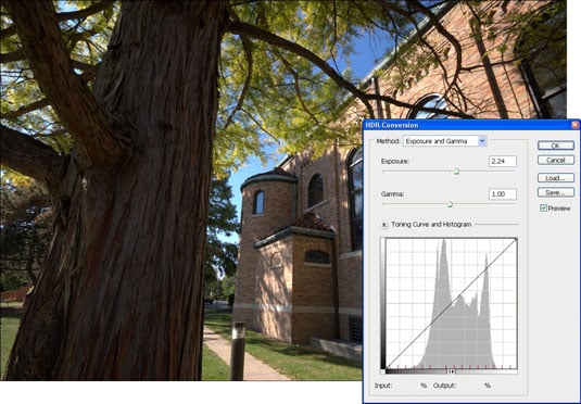
Exposure and Gamma: This is a fancy name for brightness (exposure) and contrast (gamma). You are in control of the sliders and can choose whatever values look good to you.
This figure shows the Exposure and Gamma options in the HDR Conversion dialog box that you can use to work on an HDR image. You can see from the photo that this is a very realistic result. The histogram indicates there are not very many highlights, however.
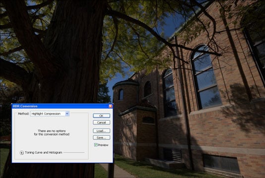
Highlight Compression: Similar to Tone Compressor in Photomatix Pro, but Highlight Compression squeezes highlights in a 32-bit/channel HDR image down to where they don’t clip in a 16-bit or 8-bit/channel low dynamic range image. There are no controls for this method. Choose it from the Method drop-down list to use it.
This figure illustrates the HDR Conversion dialog box with the Highlight Compression option selected, and the result on an HDR image. This image would require a lot of work to make it look presentable — the tree is far too dark.
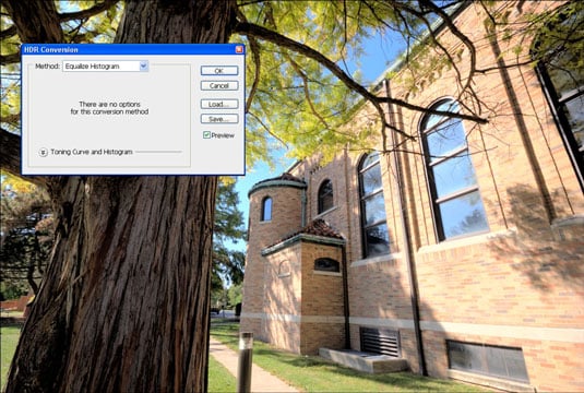
Equalize Histogram: This tool is also similar to the Tone Compressor in Photomatix Pro. Equalize Histogram squeezes the entire dynamic range of the HDR image into the low dynamic range image space while trying to retain an appropriate contrast level. There are no controls for this method. Choose it from the Method drop-down list to use it.
This figure shows the Equalize Histogram option selected and the effect. Not bad, although in this case, it looks a little posterized.
Local Adaptation: This is the squirrelly one, but it’s also the method that can create more artistic results. The Local Adaptation is selected in this figure. The two controls are Radius and Threshold sliders (shown at their default values), and you can use the histogram to apply a toning curve.
Notice that a tone curve has been applied to the histogram (click the arrows by the Toning Curve and Histogram label if you don’t see this area) to control the image’s overall brightness and contrast. Bring in the end points of the histogram and alter contrast by changing the curve. Although you can see it in every method, you can edit only when you use the Local Adaptation method.
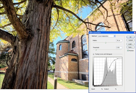
The point of Local Adaptation is to alter local contrast. The settings operate like this:
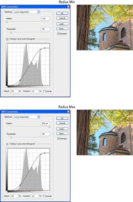
Radius: Radius acts like a local contrast control. Turning it up emphasizes local contrast, and turning it down reduces local contrast. Use Radius to control the overall strength of the tone mapping effect.
This figure shows the minimum and maximum values for Radius, while Threshold stays at the default. To see where the difference is largest, look at the leaves and the bright area on the wall. They are much brighter when Radius is at maximum.
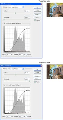
Threshold: Threshold acts like a smoothing control. Increasing it smoothes the effects of increased local contrast. Use Threshold to smooth differences between light and dark areas.
This figure illustrates minimum and maximum values for Threshold. Radius is at the default value. Here, the difference is dramatic. With Threshold at minimum, the image is very smoothed — almost blurred. At maximum, there are obvious halos that detract from the image.
Reduce the Radius and/or Threshold if you’re having problems with halos.