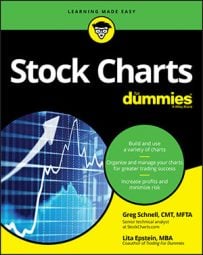
The NASDAQ composite breadth
The NASDAQ composite ($COMPQ) is the name for all of the NASDAQ listed stocks compiled together. The NASDAQ Stock Exchange has a lot of small tech companies that struggle as well as some exceptionally huge, successful tech companies. The index behaves different from the S&P 500 ($SPX) and can be helpful in monitoring breadth as an early warning. The threshold levels never get as strong, and the charts can show weakness early.This image shows the NASDAQ composite ($COMPQ) with a bullish percent index ($BPCOMPQ) below the level the market usually breaks down from (60 percent). It also shows that the percentage of NASDAQ stocks above the 200 DMA ($NAA200R) is only at 50 percent. It will be difficult to make higher highs if only 50 percent of the stocks are above the 200 DMA.
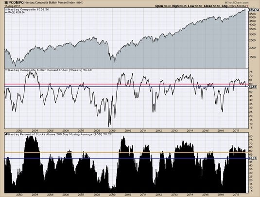 Chart courtesy of StockCharts.com
NASDAQ composite breadth.
The settings on the chart to make the display can be confusing at first. This image shows the settings used to create the NASDAQ composite chart shown above. The chart style for the percentage of stocks above the 200 DMA is a histogram type. Use the overlay tool to add reference lines on the chart.
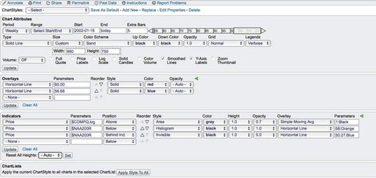 Chart courtesy of StockCharts.com
NASDAQ breadth settings.
The NASDAQ 100 Index ($NDX) is typically the fastest-moving index because of the high-growth-rate companies that are listed there. The NASDAQ 100 list includes all the giant tech companies. Because of the size of these large companies, as long as this index continues to do well, the NASDAQ 100 market can continue to outperform. Almost all of these companies are also in the S&P 500. When the NASDAQ 100 chart holds up, usually that is supportive of the S&P 500. If the NASDAQ 100 breadth starts to weaken, that can be a much better clue that the overall market is probably going to pull back deeper than most people expect when the correction starts.
The image below shows that the bullish percent index is very weak, with only 52 percent of the stocks on a buy signal, but the percentage of stocks above the 200 DMA shows 69 percent, well above 65 percent.
 Chart courtesy of StockCharts.com
NASDAQ 100 breadth.
Which chart is right? If the percentage of stocks above the 200 DMA is still holding up well, the market will probably try to rally before a more serious break. If a lot of stocks are well above the 200 DMA, a significant move will be required to get below the 200 DMA.
Lastly, while it looks like the crash of the tech stocks in 2000 was obvious in the top panel, the bullish percent index was whipping wildly in extremes for multiple years. These huge percentage swings made it difficult to be on either side of the market. Unfortunately, the data for the percentage of stocks above the 200 DMA was not calculated at the time.The New York Stock Exchange composite breadth
While the NASDAQ Stock Exchange has more high fliers, the NYSE has a lot of the great stable U.S. companies that investors can trust to deliver dividends and growth of capital. With so many banks, utilities, and pipeline companies listed on the exchange, the breadth charts are different as well.A significant majority of financial, insurance, and real estate stocks are listed on the NYSE. These stocks don’t have a growth rate that compares to the NASDAQ 100, but the shareholders of these stocks are focused on dividends and consistent growth. This type of investor is a longer-term investor and does not typically chase momentum stocks.
The chart below shows both indicators for the New York Stock Exchange composite right at the levels where it usually holds. The levels are so close, there was not room to post the lines with the market levels.
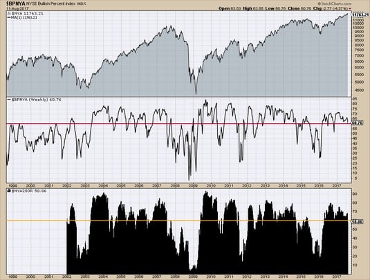 Chart courtesy of StockCharts.com
New York Stock Exchange composite breadth.
The Toronto Stock Exchange breadth
Canada exports a lot of products to the United States, but its stock markets can be very different. The chart shape in August 2017 makes the Canadian market breadth an interesting contrast to U.S. market breadth to see how the charts break down. The BPI is well below the 70 percent level, and the percentage of stocks above the 200 DMA is below 46. The market has moved 1,000 points away from the high while the U.S. markets hit all-time highs.Using the breadth indicators would help Canadian investors see the weakness in their market before their trading account becomes damaged, while U.S. stocks continued higher almost every week.
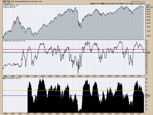 Chart courtesy of StockCharts.com
Toronto Stock Exchange breadth.
The Canadian market has a significant weighting in oil and gas, financials, and mining. These three groups make up two-thirds of the market in Canada. While the developments in other sectors of the market can add thrust, at least two of the major sectors have to be doing well for the market to go higher.