


What the boxplot shape reveals about a statistical data set
A boxplot can show whether a data set is symmetric (roughly the same on each side when cut down the middle) or skewed (lopsided). A symmetric data set shows the median roughly in the middle of the box.The median, part of the five-number summary, is shown by the line that cuts through the box in the boxplot.
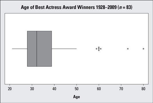
Skewed data show a lopsided boxplot, where the median cuts the box into two unequal pieces. If the longer part of the box is to the right (or above) the median, the data is said to be skewed right. If the longer part is to the left (or below) the median, the data is skewed left.
 n = 83 actresses)."/>
If one side of the box is longer than the other, it does not mean that side contains more data. In fact, you can't tell the sample size by looking at a boxplot; it's based on percentages of the sample size, not the sample size itself. Each section of the boxplot (the minimum to Q1, Q1 to the median, the median to Q3, and Q3 to the maximum) contains 25 percent of the data no matter what. If one of the sections is longer than another, it indicates a wider range in the values of data in that section (meaning the data are more spread out). A smaller section of the boxplot indicates the data are more condensed (closer together).
Although a boxplot can tell you whether a data set is symmetric (when the median is in the center of the box), it can't tell you the shape of the symmetry the way a histogram can.

Despite its weakness in detecting the type of symmetry (you can add in a histogram to your analyses to help fill in that gap), a boxplot has a great upside in that you can identify actual measures of spread and center directly from the boxplot, where on a histogram you can't. A boxplot is also good for comparing data sets by showing them on the same graph, side by side.
What a boxplot reveals about the variability of a statistical data set
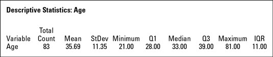
Variability in a data set that is described by the five-number summary is measured by the interquartile range (IQR). The IQR is equal to Q3 – Q1, the difference between the 75th percentile and the 25th percentile (the distance covering the middle 50 percent of the data). The larger the IQR, the more variable the data set is.From the above figure showing the descriptive statistics for Best Actress ages, the variability in age of the Best Actress winners, as measured by the IQR, is Q3 – Q1 = 39 – 28 = 11 years. Of the group of actresses whose ages were closest to the median, half of them were within 11 years of each other when they won their awards.
Notice that the IQR ignores data below the 25th percentile or above the 75th, which may contain outliers that could inflate the measure of variability of the entire data set. So if data is skewed, the IQR is a more appropriate measure of variability than the standard deviation.

