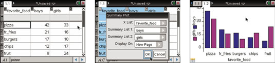
One interesting feature of the TI-Nspire is that categorical data can be represented with a summary plot. A summary plot is an excellent way to compare two data sets side by side. A group of students were asked to share their favorite food; the results can be found in the first screen. Notice that the data is separated into boy and girl categories.
After the data is typed into a Lists & Spreadsheet page, follow these steps to graph the summary plot:
Highlight all three columns of data. Click the A that names the first list, press and hold the [SHIFT] key, then press

twice.
Perform a right-click, [CTRL][MENU]→Summary Plot.
Fill in the Summary Plot dialog box. Here, the Display On field is changed to New Page. See the second screen.
Press [ENTER] to plot the graph.
Right-click on a bar to change its color. Press [CTRL][MENU]→Color→Fill Color.
The color of the girls bars is changed to magenta and the boys color to blue. See the result in the third screen.
You can grab and drag the labels (pizza, chips, and so on) and change the order of the display of the bars in the chart.