
A stem-and-leaf plot is a graphical device in which the distribution of a dataset is organized by the numerical value of the observations in the dataset. The diagram consists of a "stem," showing the different categories in the data, and a "leaf," which shows the values of the individual observations in the dataset.
For example, the following is a stem-and-leaf diagram for the daily prices of Microsoft stock from January 1, 2013 to December 31, 2013. The prices range from $25.16 to $38.14:
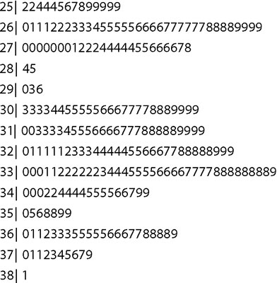
On the stem-and-leaf plot, each line represents a single category; for this dataset, each category is a dollar amount. For example, the category 32 consists of all prices between $32.00 and $32.99. Each price for Microsoft stock is quoted in dollars and cents. The left side of the bar shows the dollars (the stems); the right side of the bar shows the cents (the leaves), after rounding to the nearest 10 cents. For example, a price of $32.23 is rounded to $32.20, and this appears as a 2 on the right-hand side of the bar for the category 32. A price of $33.48 is rounded to $33.50; this appears as a 5 on the right-hand side of the bar for the category 33.
Using this technique, it's easy to see how many prices fall into each category. For example, there were 14 trading days in the dataset in which the price of Microsoft stock was between $25.00 and $25.99. There were three trading days in which the price of Microsoft stock was between $29.00 and $29.99. A price between $33.00 and $33.99 occurred most frequently, and a price between $38.00 and $38.99 was the most infrequent during the year.
One of the advantages of a stem-and-leaf diagram is that it's easy to identify the mode of a dataset. (Recall that the mode is the value that occurs most frequently in a dataset.) If you look only at the dollar ranges, then it's easy to spot which range contains the most observations — the one with the longest leaf. In this case, a price in the 33 range ($33.00–$33.99) would be considered to be the mode because it contains the most observations.
Another advantage of this diagram is that outliers are easy to spot. An outlier is an observation in a dataset that is significantly larger or smaller than the other observations in the dataset. An outlier would be indicated by a large gap between either the first or last stem and the next closest one. (Chapter 10 talks more about outliers.)
One drawback to stem-and-leaf diagrams is that they become difficult to interpret for large datasets because the size of the leaf becomes unwieldy.