


A scattergraph helps you visualize the relationship between activity level and total cost. To scattergraph, just follow these steps (with explanations for creating the scattergraph in Microsoft Excel):
Set up a table that shows production level and total cost by time period.
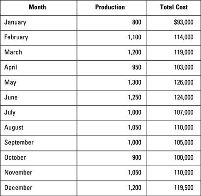
To prepare a scattergraph, you need basic data about the number of units produced and the total costs per time period. Arrange this data by month, week, or some other time period.
Set up a graph with units produced at the bottom axis and total cost in the left axis.
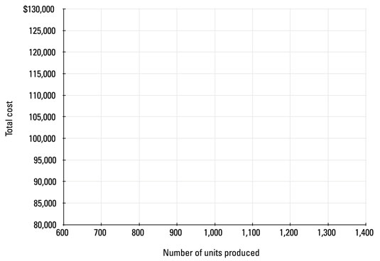
Your graph should have the total cost (which includes fixed and variable costs) on the y–axis and the number of units produced along the x–axis as shown.
On this graph, plot each point from the table.
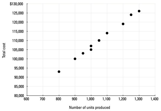
Plot each data point on your graph. You can do so manually by using graph paper or electronically by using Excel’s Chart Wizard:
Enter the data from Step 1 into the Excel spreadsheet.
Select only the two columns of data (Production and Total Cost).
In the Insert menu, click on Scatter and then Scatter with only Markers.
Label the axes appropriately.
If you’re trying to predict total costs for a future month, select the anticipated activity level for that month along the x-axis. Then use data points from previous months to estimate the total cost.

