

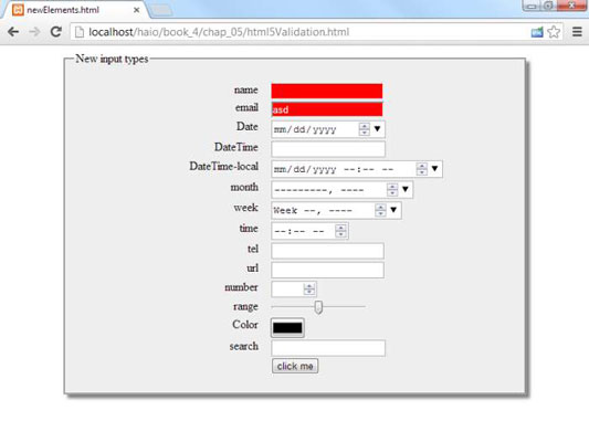
HTML5 and CSS3 add a few more tricks to simplify validation, and they are absolutely wonderful. While you can always use JavaScript and regular expressions to validate your pages, HTML5 promises a much easier solution. When you use the special-purpose input elements, the browser will automatically check the form field to ensure it is in a proper format.
If the entry is not valid, the form will (generally) not submit, and the special :invalid CSS pseudo-class will be associated with the invalid field. Simply supply CSS to your page handling the :invalid state:
 :invalid {
  background-color: red;
 }
When this CSS state is active, any invalid fields will have the :invalid styling. For example, if you have an email field defined and the content of that field is not a valid e-mail address, the invalid style will be applied. As soon as the address is in the right format, the invalid style will be removed.
The developer doesn't need to add any other code to the form. Simply add CSS to display invalid entries, and the browser will do the rest. You don't even need to specify the regular expression for e-mail addresses or any other specialty input fields — the appropriate regular expression for each field type is already built in.
Note that if a field is required (with the required attribute), it will be considered invalid until it contains some value.
It is possible that the browser will refuse to process a form until all fields are validated, but this behavior does not yet seem to be universal among HTML5-compliant browsers.
If you wish, you can turn off the validation for any field by adding the novalidate attribute to that element.
  <style type = "text/css">
    fieldset {
     width: 600px;
     background-color: #eeeeee;
     margin-left: auto;
     margin-right: auto;
     box-shadow: 5px 5px 5px gray;
    }
    label {
     float: left;
     clear: left;
     width: 250px;
     text-align: right;
     padding-right: 1em;
    }
    input {
     float: left;
    }
    :required {
     border: 1px solid red;
    }
    :invalid {
     color: white;
     background-color: red;
    }
    button {
     display: block;
     margin-left: auto;
     margin-right: auto;
     clear: both;
    }
    </style>
How to add a pattern
The pattern attribute allows you to specify a regular expression used to validate the form. If the content matches the regular expression, the field will be considered valid. The pattern attribute should be used only when the standard validation techniques are not sufficient (that is, you're using an ordinary input element that doesn't have an automatic pattern) because it can be difficult to debug regular expressions.
  <input type = "text"
    id = "txtPhone"
    pattern = "(d{3}) +d{3}-d{4}"
    title = "(ddd) ddd-dddd" />
When you specify a pattern, you should also include a title attribute. The title should indicate what the pattern is. The browser can use this as a tip for the user. It may also be useful to add pattern information as placeholder text.
How to mark a field as required
The required attribute allows you to specify a particular field as required. Supporting browsers will mark all required fields (perhaps by highlighting them in red) if they are not filled in. Some browsers will also send a warning if the user tries to submit a form with empty required fields.
  <input type = "text"
    required />
The special :required pseudo-class allows you to apply a CSS style to all required elements in your form (giving them a border or background-color, for example). Here's an example of a CSS style for marking required elements with a red border:
 :required {
 border: 1px solid red;
 }
If you have a required field and it has no content, that field will trigger the invalid style.
How to add placeholder text
The placeholder attribute allows you to add a special placeholder value in your text fields. This placeholder acts as a temporary label showing the purpose of the field without requiring a label tag. As soon as the user activates the field, the placeholder text disappears.
  <input type = "text"
    placeholder = "Name" />
Not all browsers support placeholder text. Other browsers will simply ignore the placeholder attribute. Likewise, if the field is already filled in, the placeholder will not be visible. For these reasons, it is still preferred to add a label so users know what to type in each text area. Placeholder text is especially helpful when it is used to indicate how the input should be formatted.

