Borders have been a part of CSS from the beginning, but CSS3 adds some really exciting new options. Modern browsers now support borders made from an image as well as rounded corners and box shadows. These techniques promise to add exciting new capabilities to your designs.
Image borders
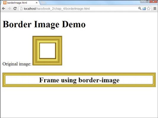
CSS3 allows you to use an image for an element border. The mechanism is quite powerful because it detects the edges of an image and “slices” it to create the edges and corners of the border from the edges and corners of the image.

The frame image is stored as frame.png in the same directory as the HTML file. It has a transparent center. Apply the following code to add an image border around all elements on the page:
 h2 {
 border-width: 15px;
 border-image: url("frame.png") 25% repeat;
 -webkit-border-image: url("frame.png") 25% repeat;
 -moz-border-image: url("frame.png") 25% repeat;
 }
Here's how you add a border image:
Acquire your image.
The image should already be designed as some sort of border. Typically it will be a shape around the edges, with either a solid-color center or a transparent center.
Specify the border width.
You'll need to indicate the border width directly. The border of the frame image is scaled to fit whatever size you want.
Calculate how much of the image's border you want.
If you leave off the percent sign, the value calculates in pixels. You can add four values if you prefer to use different amounts of the original image for each boundary.
Indicate the behavior you want.
The original image is almost never the same size as the element you're wanting to surround, so you can supply a tip to explain how the browser should handle elements larger than the original. The most common choices are repeat (repeat the original image) or stretch (to take up the entire space). With a simple image like the frame.png used in this example, the results will be the same.
How to add Rounded Corners
Older CSS was known for being very rectangular, so web designers tried to soften their designs by adding rounded corners. This was a difficult effect to achieve. CSS3 greatly simplifies the creation of rounded corners with the border-radius rule.
It's pretty easy to get rounded corners on those browsers that support the tag:
<!DOCTYPE HTML>
<html lang = "en">
<head>
<title>corners.html</title>
<meta charset = "UTF-8" />
<style type = "text/css">
h1 {
width: 60%;
background-color: #000066;
color: #9999ff;
border: #9999ff 3px groove;
margin: auto;
text-align: center;
border-radius: .5em;
}
</style>
</head>
<body>
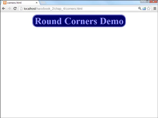
<h1>Round Corners Demo</h1>
</body>
</html>
The rule works by cutting an arc from each corner of the element. The arc has the specified radius, so for sharp corners, you'll want a small radius. You can measure the radius in any of the common measurements, but pixels (px) and character width (em) are the most commonly used.
The border is not visible unless the element has the background-color or border defined. Note that there are variations of each tag to support specific corners. This can be useful if you do not wish to apply the same radius to all four corners of your element. The most recent browsers now support the generic border-radius rule.
You can pick up a number of the previous-generation browsers by using the vendor-specific prefix. If your browser does not understand the border-radius rule, it will simply create the ordinary squared corners.
How to add a box shadow
Box shadows are often added to elements to create the illusion of depth.
The box shadow effect is not difficult to achieve, but it is normally done as part of a class definition so it can be re-used throughout the page. Here's some sample code:
<!DOCTYPE HTML>
<html lang = "en">
<head>
<title>boxShadow.html</title>
<meta charset = "UTF-8" />
<style type = "text/css">
.shadow {
box-shadow: 10px 10px 10px #000000;
height: 200px;
width: 200px;
padding: 1em;
border: 1px solid black;
border-radius: 5px;
background-color: #EEEEEE;
}
</style>
</head>
<body>
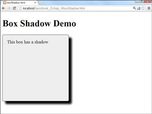
<h1>Box Shadow Demo</h1>
<div class = "shadow">
This box has a shadow
</div>
</body>
</html>
Adding a box shadow is much easier in CSS3 than it once was. Here are the steps:
Define a class.
Often you'll want to apply the same settings to a number of elements on a page, so the box shadow is often combined with other elements like background-color and border in a CSS class that can be reused throughout the page.
Add the box-shadow rule.
The latest browsers support the standard box-shadow rule, but you may also want to include browser prefixes to accommodate older browses.
Specify the offset.
A shadow is typically offset from the rectangle it belongs to. The first two values indicate the horizontal and vertical offset. Measure using any of the standard CSS measurements (normally pixels or ems).
Determine the blur and spread distances.
You can further modify the behavior of the shadow by specifying how quickly the shadow blurs and how far it spreads. These are optional parameters.
Indicate the shadow color.
You can make the shadow any color you wish. Black and gray are common, but you can get interesting effects by picking other colors.
Many other shadow effects are possible. You can add multiple shadows, and you can also use the inset keyword to produce an interior shadow to make it look like part of the page is cut out.