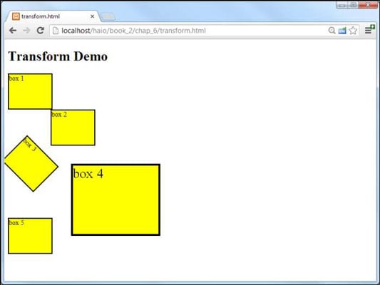
CSS3 includes the ability to apply geometric transformations onto any element in your HTML5 web page. This provides a remarkable level of visual control not previously available to web developers.
The transform attribute allows you to apply a mathematical transformation to any div. When you apply transform to an element, you need to apply one or more of the following parameters to describe the type of transformation:
translate: Moves the object from its default position. Translation requires two parameters, an X measurement and a Y measurement. Use the standard CSS measurement units.
rotate: Rotates the image around its center value. Takes one parameter, an angle measurement in degrees. (For example, 30 degrees is 30deg.)
scale: Changes the size of the object. The standard version changes both the horizontal and vertical size uniformly. The scalex and scaley attributes can be used to adjust the scale along an individual axis. Scale is measured in the standard CSS measurement units. If scale is larger than 1, the object is larger than the original. A scale between zero and one makes the item smaller than it was.
skew: This allows you to tilt the element by some angle. The parameter requires an angle measurement in degrees. The skewx and skewy variations allow for more complete control of the transformation.
You can combine multiple parameters by listing them after the transform attribute separated by spaces.
To illustrate, imagine the following HTML snippet:
<div id = "box1">box 1</div> <div id = "box2">box 2</div> <div id = "box3">box 3</div> <div id = "box4">box 4</div> <div id = "box5">box 5</div>
The code shows five identical divs. For illustration purposes, all the divs share the same common CSS:
#box1, #box2, #box3, #box4, #box5{ width: 100px; height: 80px; border: 3px solid black; background-color: yellow; }
Apply variations of the attribute to each element to see how the transformations work.

#box2 { transform: translate(100px, 0px); } #box3 { transform: rotate(45deg); } #box4 { transform: scale(2) translate(100px, 0px); } #box5 { transform: skew(3); }
Note that browser support is changing on this element. Chrome and Safari still expect the –webkit prefix, but Firefox and Opera support the non-prefixed version. IE 10 theoretically works with the standard version, but version 9 requires the –ms- prefix, and earlier versions of IE simply ignore transformations altogether. If you view the actual source code of the transform.html site, you'll see multiple versions to handle the various browsers:
 #box2 {
 transform: translate(100px, 0px);
 -webkit-transform: translate(100px, 0px);
 -ms-transform: translate(100px, 0px);
 }
Eventually, common sense will break out and vendor-specific prefixes will no longer be necessary, but for the time being, it's safest to put them all in place. If you want to catch older versions of Firefox and Opera, you can also include these (-moz- and –o-) prefixes as well.

