
As browsers become more powerful, interesting new capabilities for HTML5 and CSS3 programming are emerging. One of the more exciting developments is the formation of 3D transformations. A 3D transform is similar to the traditional transformations, but it allows for a virtual third axis.
Ordinary, 2D animations utilize the 2D coordinate system, with an X axis going side-to-side and a Y axis traversing top-to-bottom. Even in 2D transformations, there is a tacit acknowledgment of a Z axis. The Z axis goes through the center of the object and points directly to the viewer's eyes and back into infinity behind the screen. 2D rotations are around this imaginary Z axis.
You can determine which elements overlap other elements through the CSS property, so although all screen elements are the same actual distance from the user, they appear to have some form of depth.
3D transformations have the same general operations as 2D (translate, rotate, and scale), but you can apply the transformation along one of the three axes: X, Y, or Z.
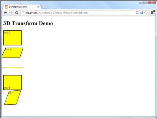
You see five boxes with nearly identical styles. Each box has a different 3D transformation applied:
Box 1 has default behavior: Box 1 uses ordinary layout with no 3D transformation applied at all.
Box 2 is rotated 45 degrees around x: Box 2 appears to be truncated, but it's actually rotated around the horizontal (X) axis. Note that both the box itself and the text inside the box are shortened.
Box 3 is nearly invisible: Box 3 has also been rotated around the X axis, but this one is rotated nearly 90 degrees, so it's almost invisible.
Box 4 is upside-down: Box 4 is rotated 180 degrees around the X axis, flipping it completely. Note that rotating around the Y axis would also flip the box, but the text would remain at the top, and would be reversed along the vertical axis.
Box 5 is doing all kinds of crazy things: Box 5 has two transformations applied at the same time. It is rotated 45 degrees around x and -45 degrees along y.
Take a look at the code to see exactly what is happening here.
<!DOCTYPE HTML>
<html lang = "en">
<head>
 <title>transform3D.html</title>
 <meta charset = "UTF-8" />
 <style type = "text/css">           body {
 perspective: 1000;
 -webkit-perspective: 1000;
 }
 #box1, #box2, #box3, #box4, #box5{
 width: 100px;
 height: 80px;
 border: 3px solid black;
 background-color: yellow;
 }
  #box2 {
 transform: rotateX(45deg);
 -webkit-transform: rotateX(45deg);
 }
 #box3 {
 transform: rotateX(89deg);
 -webkit-transform: rotateX(89deg);
 }
 #box4 {
 transform: rotateX(180deg);
 -webkit-transform: rotateX(180deg);
 }
 #box5 {
 transform: rotate3D(1, 2, 0, 45deg);
 -webkit-transform: rotate3D(1, -1, 0, 45deg);
 }
 </style>
</head>
<body>
 <h1>3D Transform Demo</h1>
 <div id = "box1">box 1</div>
 <div id = "box2">box 2</div>
 <div id = "box3">box 3</div>
 <div id = "box4">box 4</div>
 <div id = "box5">box 5</div>
</body>
</html>
The first new rule is perspective. Change the perspective of the parent element that will contain your transformed elements. This gives you the ability to determine how the elements appear to be displayed. The perspective indicates how close the camera appears to be to the elements.
Boxes 2 through 4 all use the same transformation rule: . This mechanism is much like the 2D rotate ()function, but it rotates along the X axis. There are also rotatey ()and rotatez () functions, but rotatez ()is infrequently used because it's just like the 2D rotate ()technique.
If you want to apply more than one rotation, you can use the rotate 3d () function. This function takes four parameters. The first three are modifiers for the three axes, and the fourth is an angle.
CSS3 also supports the translatex, translatey (), and translatez () functions. These mechanisms allow you to specify a translation along a specific axis The translate3d() function allows you to translate along multiple axes at the same time.
CSS3 includes scalex, scaley, and scalez functions, but again these are not always used because they act similar to the 2D scaling function. There is also a scale 3d () function for use with multiple scales.
Support for the 3D transformations is growing but not complete. At the moment, the –webkit and no-prefix versions will support most browsers. The IE family of browsers has limited support for 3D transformations.