When you create a histogram, it's important to group the data sets into ranges that let you see meaningful patterns in your statistical data. For example, say you want to see if actresses who have won an Academy Award were likely to be within a certain age range.
The following image shows a histogram of Best Actress Academy Award winners' ages between 1928 and 2009.
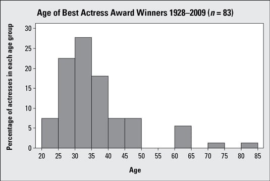
This image shows groups of 5 years each because increments of 5 create natural breaks for years and because it provides enough bars to look for general patterns. For example, you can see that most winners, about 68 percent, were between the ages of 25 and 40, with a definite spike between the ages of 30 and 35.
Keep in mind that you don't have to use this particular grouping; you have a bit of flexibility when making a histogram. Here are some useful tips:
Each data set requires different ranges for its groupings, but you want to avoid ranges that are too wide or too narrow.
If a histogram has really wide ranges for its groups, it places all the data into a very small number of bars that make meaningful comparisons impossible.
If the histogram has very narrow ranges for its groups, it looks like a big series of tiny bars that cloud the big picture. This can make the data look very choppy with no real pattern.
Make sure your groups have equal widths. If one bar is wider than the others, it may contain more data than it should.
One solution that may be appropriate for your histogram is to take the range of the data (largest minus smallest) and divide by 10 to get 10 groupings.
What if a winner is 30 years old? Does she belong in 25–30 or 30–35? As long as you are consistent with all the data points, you can either put all the borderline points into their respective lower bars or put all of them into their respective upper bars. The important thing is to pick a direction and be consistent. It is common practice to make the bar intervals left inclusive (that is, the bars include the left endpoint but not the right).