
Power View is a COM (Component Object Model) add-in that comes with most versions of Excel 2013. This add-in works with PowerPivot for Excel 2013 to enable you create visual reports for your Excel Data Model.
To use the Power View add-in to create a visual report for the Data Model represented in your Excel pivot table, click the Power View button on the Insert tab of the Excel Ribbon or press Alt+NV.
Excel then opens a new Power View sheet (with the generic sheet name, Power View1) while at the same displaying a Power View tab on the Ribbon and the Power View Fields task pane on the right-hand side of the window.
You then select the fields from related tables listed in the Power View Fields task pane that you want visually represented in the Power View report. Power View then displays the data for the selected fields graphically as small tables on the Power View worksheet, while at the same time selecting a Design tab on the Ribbon that contains a Switch Visualization group with these options:
Table to represent the selected dataset in the Power View sheet in the default tabular view after applying one of the other visualization options to the dataset
Bar Chart to represent the selected dataset in the Power View sheet as some sort of bar chart
Column Chart to represent the selected dataset in the Power View sheet as some sort of column chart
Other Chart to represent the selected dataset in the Power View sheet as some other type of chart
Map to represent the selected dataset in the Power View sheet as different sized circles on a map of the world
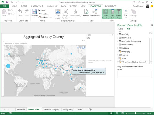
The figure shows a prime example of the kind of visual report that you might want to create with the Power View add-in. The map on this Power View worksheet shows the total sales geographically with different sized circles that represent the relative sales in that region.
When you position the mouse or Touch pointer on one of the circles in this Power View report, Excel displays a text box containing the name of the region followed by the total amount of its sales.
To create this Power View report, you simply select the SalesAmount field in the FactSales data table as well as the RegionCountryName field in the related Geography data table. (These two tables are related in a one-to-many relationship using a GeographyKey field that is primary in Geography data table and foreign in the FactSales data table.)
After selecting these two fields in the Power View Fields task pane of the Power View worksheet by clicking their field names after expanding their tables in the list, the visual report was created simply by clicking somewhere in the table to select it and then clicking the Map option in the Switch Visualization group of the Design tab and then replacing the generic, Click Here to Add a Title, with the Aggregated Sales by Country label shown there.