One of the most interesting and useful forms of data analysis you can perform in Excel is regression analysis. In regression analysis, you explore the relationship between two sets of values, looking for association. For example, you can use regression analysis to determine whether advertising expenditures are associated with sales, whether cigarette smoking is associated with heart disease, or whether exercise is associated with longevity.
Often your first step in any regression analysis is to create a scatter plot, which lets you visually explore association between two sets of values. In Excel, you do this by using an XY (Scatter) chart.
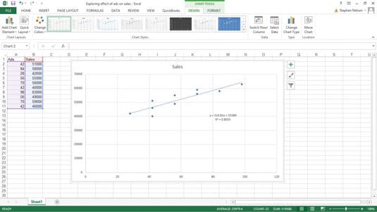
For example, suppose that you want to look at or analyze these values. The worksheet range A1:A11 shows numbers of ads. The worksheet range B1:B11 shows the resulting sales. With this collected data, you can explore the effect of ads on sales—or the lack of an effect.

To create a scatter chart of this information, take the following steps:
Select the worksheet range A1:B11.
On the Insert tab, click the XY (Scatter) chart command button.
Select the Chart subtype that doesn't include any lines.
Excel displays your data in an XY (scatter) chart.

Confirm the chart data organization.
Confirm that Excel has in fact correctly arranged your data by looking at the chart.
If you aren't happy with the chart’s data organization — maybe the data seems backward or flip-flopped — click the Switch Row/Column command button on the Chart Tools Design tab. (You can even experiment with the Switch Row/Column command, so try it if you think it might help.) Note that here, the data is correctly organized. The chart shows the common-sense result that increased advertising seems to connect with increased sales.
Annotate the chart, if appropriate.
Add those little flourishes to your chart that will make it more attractive and readable. For example, you can use the Chart Title and Axis Titles buttons to annotate the chart with a title and with descriptions of the axes used in the chart.
Add a trendline by clicking the Add Chart Element menu’s Trendline command button.
To display the Add Chart Element menu, click the Design tab and then click the Add Chart Element command. For the Design tab to be displayed, you must have either first selected an embedded chart object or displayed a chart sheet.
Excel displays the Trendline menu. Select the type of trendline or regression calculation that you want by clicking one of the trendline options available. For example, to perform simple linear regression, click the Linear button.
In Excel 2007, you add a trendline by clicking the Chart Tools Layout tab’s Trendline command.
Add the Regression Equation to the scatter plot.
To show the equation for the trendline that the scatter plot uses, choose the More Trendline Options command from the Trendline menu.
Then select both the Display Equation on Chart and the Display R-Squared Value on Chart check boxes. This tells Excel to add the simple regression analysis information necessary for a trendline to your chart. Note that you may need to scroll down the pane to see these check boxes.
In Excel 2007 and Excel 2010, you click the Charting Layout tab’s Trendline button and choose the More Trendlines Option to display the Format Trendline dialog box.
Use the radio buttons and text boxes in the Format Trendline pane to control how the regression analysis trendline is calculated. For example, you can use the Set Intercept = check box and text box to force the trendline to intercept the x-axis at a particular point, such as zero.
You can also use the Forecast Forward and Backward text boxes to specify that a trendline should be extended backward or forward beyond the existing data or before it.
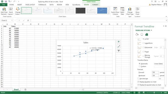
Click OK.
You can barely see the regression data, so this has been formatted to make it more legible.