
Sometimes you need to display data in chart form. Snow Leopard’s Numbers application gives you the ability to use the data you add to a spreadsheet to generate a professional-looking chart. Follow these steps to create a chart in Numbers:
Select the adjacent cells you want to chart by dragging the mouse.
To choose individual cells that aren’t adjacent, you can hold down the Command key as you click.
Click the Charts button on the Numbers toolbar.
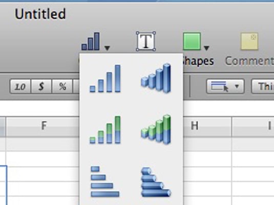
The Charts button bears the symbol of a bar graph.
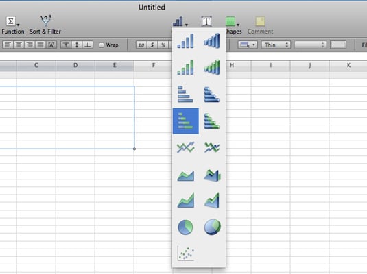
Numbers displays the thumbnail menu.
Click the thumbnail for the chart type you want.
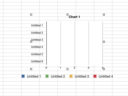
Numbers inserts the chart as an object within your spreadsheet so that you can move the chart. You can drag using the handles that appear on the outside of the object box to resize your chart.
Click the Inspector toolbar button and you can switch to the Chart Inspector dialog, where you can change the colors and add (or remove) the chart title and legend.
To change the default title, click the title box once to select it; click it again to edit the text.
After you’ve added your chart to the sheet, you’ll note that it appears in the Sheets list. To edit the chart at any time, just click the corresponding entry in the Sheets list.