
Seeking clarification is critical in Six Sigma and normal probability plots can help with this. When someone tells you that his or her data are normal, always respond with, “How normal are they?” No real-world data are perfectly normal. So the question you should be asking isn’t “Are the data normal?” but rather “How normal are the data?”
Before performing an analysis, we recommend that you determine just how closely your data follow a normal distribution by creating a normal probability plot. Then, depending on your situation, you can decide whether your data are normal enough to proceed with using the statistical tools that assume normality.
If you have hundreds of points of data in your sample, one way to check for how normal your data are is to simply create a dot plot or histogram of the data. The closer the plot follows a symmetrical bell shape, the more normal it is.
When you don’t have hundreds of data points, however, the dot plot/histogram method becomes less and less reliable. A normal probability plot is a straightforward way to gauge how normal your data are regardless of how much data you have.
With a set of data from a process or product characteristic, you’re ready to begin the steps to creating a normal probability plot:
Order your n number of points of raw data from the minimum value to the maximum observed values.
Assign a rank order number (i) to each of the n points of data.
That is, from minimum to maximum, is the point of data the 1st, 7th, or 98th?
Calculate the cumulative probability (pi) associated with each rank-ordered point of data.
Use the following formula:
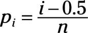
Use the standard normal table found in Table 12-3 to calculate the zi value for each of your n points of data.
For example, if the calculated cumulative probability for your seventh rank-ordered data point p7 = 0.140, you find the closest value in the body of the table and record the associated z value. For 0.140, the closest entry in the table is 0.140071, which corresponds to a z7 of 1.08.
Because a standard normal curve is perfectly symmetrical, each probability has two possible corresponding z values. Both values have the exact same magnitude, but one is positive and the other is negative. Imagine a drawing of a perfect bell curve: For any selected point on the curve, another point has the exact same vertical height on the mirrored side.
For every normal probability plot, as you figure the z values for least to the greatest rank-ordered data points, the z values start negative, pass through zero, and then become positive.
Make sure your determined z values are negative for every data point that has an associated p less than 0.500 and positive for those that have a p greater than 0.500. Otherwise, the scatter plot you create with these values will be incorrect.
Create an x-y scatter plot of your measured data points versus their determined z values.
The measured data go on the x-axis, and the z values go on the y-axis.
Below is the process for creating a normal probability plot for a set of 20 measurements of a critical process characteristic.
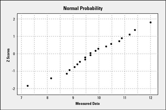
| Rank-Ordered Data | I | pi | zi |
|---|---|---|---|
| 7.3 | 1 | 0.025 | –1.96 |
| 8.2 | 2 | 0.075 | –1.44 |
| 8.8 | 3 | 0.125 | –1.15 |
| 8.9 | 4 | 0.175 | –0.93 |
| 9.1 | 5 | 0.225 | –0.76 |
| 9.2 | 6 | 0.275 | –0.60 |
| 9.3 | 7 | 0.325 | –0.45 |
| 9.5 | 8 | 0.375 | –0.32 |
| 9.5 | 9 | 0.425 | –0.19 |
| 9.7 | 10 | 0.475 | –0.06 |
| 9.7 | 11 | 0.525 | 0.06 |
| 9.9 | 12 | 0.575 | 0.19 |
| 10.0 | 13 | 0.625 | 0.32 |
| 10.3 | 14 | 0.675 | 0.45 |
| 10.5 | 15 | 0.725 | 0.60 |
| 10.8 | 16 | 0.775 | 0.76 |
| 10.9 | 17 | 0.825 | 0.93 |
| 11.2 | 18 | 0.875 | 1.15 |
| 11.4 | 19 | 0.925 | 1.44 |
| 12.0 | 20 | 0.975 | 1.96 |
After you have created your normal probability plot, look at it. Do the plotted points form a linear pattern? The closer the points are to forming a single line, the more normal your data are; the more scattered the points are, the less normal your data are.
If your normal probability plot forms even the fuzziest impression of a line, you’re close enough to normal for all the statistical tools to be validly applied for nearly all but the most sensitive situations.
Yes, the closer your data are to normal, the more closely the results of your statistical analysis will match reality. But very often, all you need for breakthrough improvement is an indication of the basic, right direction. As long as your data aren’t drastically different from normal, you’re set.