
Bar charts are made up of a series of rectangles – or bars – with each bar representing a different group. Each bar has the same width, but the heights vary to show the ‘value’ of each bar’s group – for example, how many people are in the group, or how much money comes from the group, or how many goals the team scored.
Knowing when to use a bar chart
You use a bar chart to compare the values of several numbers at once. The numbers could be measurements, amounts of money, numbers of people or things, all in different groups or categories. It lets you see at a glance which group is the most or least important.You can also figure out the actual value of each bar by drawing a horizontal line across to the scale and reading off the number.
Bar charts are a little more honest than pie charts. The human brain is much better at assessing distance than it is area and angle, so people perceive bar charts more accurately than they do pie charts. Calculating the actual value of each group on a bar chart is also easier than on a pie chart.
You use bar charts and pie charts in similar situations – when you have several, separate values attached to separate categories. One situation where you definitely use a bar chart rather than a pie chart is when looking at the numbers as part of a whole doesn’t make sense.Bar charts are better than line graphs when your data are in several distinct groups rather than over something measurable like time.
Good examples of when to use a bar graph are to compare the house prices in several different regions of the UK, to show the personal best race times of several sprinters, or to compare the heights of different species of tree.
Single-bar charts (6 charts and graphs for basic maths)
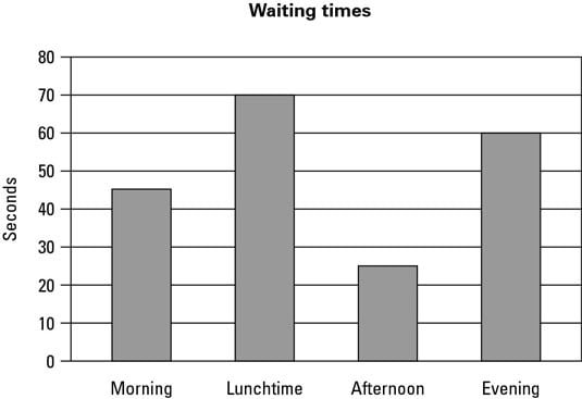
The simplest kind of bar chart is called, a little misleadingly, the single-bar chart. Any bar chart worth its salt has at least two bars in it, otherwise it’s not really comparing anything and you may as well just have written the number down. The word ‘single’ means that each category has only one number associated with it, so you get a single bar for each category.Single-bar charts are by far the easiest type of bar chart to read and understand. To find out what a bar represents, here’s what you do:
-
Get a ruler (or anything with a straight edge) and lay it flat across the top of the bar, going sideways across the graph.
-
Make a small mark where the ruler crosses the vertical axis (the vertical numbered line).
-
If the mark lies on a value given on the scale, that’s the value of the category represented by the bar.
-
If the mark lies between two values, make an estimate of the number.
Think about whether the number’s halfway between the neighbouring values, or a little more or less.
Multiple-bar charts
More complicated – and sadly, more common in exams – are multiple-bar charts. You use multiple-bar charts to compare two different values across categories. For example, to investigate exam pass rates of several schools, you may want to compare the results of boys and girls. You then have two distinct bars in each category, coded with shading.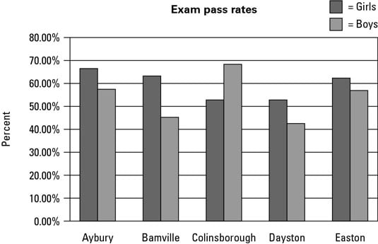
Another example is using a multiple-bar chart to compare average summer and winter temperatures in several cities.
Reading a multiple-bar chart is very similar to reading a single-bar chart. The only difference is that you need to make sure you look at the correct bar. Before you start, check the key – the little box that tells you which colour or type of shading corresponds to which subcategory – and then look at the bar in the correct category with the right colour or shading.
Stacked-bar charts
The purpose of these monstrosities is to show the changes in both the totals and the composition of a value – for instance, not only how your company’s income has changed but also how much of the income has come from each source.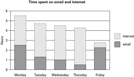
Some of the information in a stacked-bar chart is pretty easy to read – you can figure out the total value and the value of the lowest bar using the same methods you use for normal bar charts. The values in the middle and at the top are a bit trickier. Here’s what you do:
-
Work out the value of the bottom of the bar you’re interested in by measuring across to the vertical axis, as you do with a regular bar chart.
-
Work out the value of the top of the bar you’re interested in, using the same technique.
-
Take the answer in Step 1 away from the answer in Step 2.
The result is the value of the bar.