
Fluid layouts are terrific. They're very flexible, and they're not hard to build in HTML5 and CSS3. Sometimes, though, it's nice to use a fixed-width layout, particularly if you want your layout to conform to a particular background image.
The primary attribute of a fixed-width layout is the use of a fixed measurement (almost always pixels), rather than the percentage measurements used in a fluid layout.
How to set up the HTML
As usual, the HTML code is minimal. It contains a few named divs.
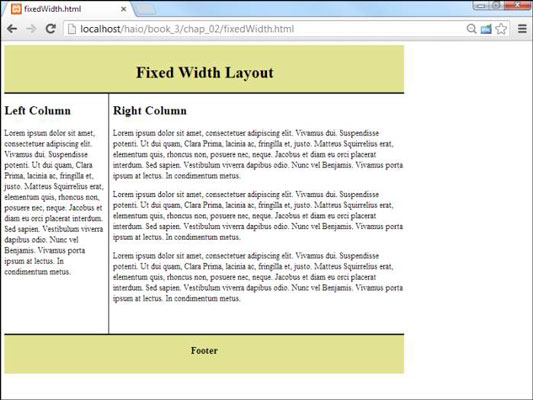
<!DOCTYPE html>
<html lang = "en-US">
 <head>
 <meta charset = "UTF-8">
 <title>fixedWidth.html</title>
 <link rel = "stylesheet"
   type = "text/css"
   href = "fixedWidth.css" />
 </head>
 <body>
 <div id = "header">
  <h1>Fixed Width Layout</h1>
 </div>
 <div id = "left">
  <h2 id="tab2" >Left Column</h2>
 </div>
 <div id = "right">
  <h2 id="tab3" >Right Column</h2>
 </div>
 <div id = "footer">
  <h3>Footer</h3>
 </div>
 </body>
</html>
Fix the width with CSS
After the HTML is set up, you can use CSS to enforce the two-column scheme.
Here's the CSS code:
#header {
 background-color: #e2e393;
 border-bottom: 3px solid black;
 text-align: center;
 width: 800px;
 padding-top: 1em;
}
#left {
 float: left;
 width: 200px;
 clear: left;
 border-right: 1px solid black;
 height: 30em;
 overflow: auto;
 padding-right: .5em;
}
#right {
 float: left;
 width: 570px;
 height: 30em;
 overflow: auto;
 padding-left: .5em;
}
#footer {
 width: 800px;
 text-align: center;
 background-color: #e2e393;
 border-top: 3px double black;
 clear: both;
}
It's all pretty straightforward:
Color each element to see what's happening.
Begin by giving each div a different background color so you can see what is happening.
Determine the overall width of the layout.
Pick a target width for the entire layout. 800 pixels has been chosen because it's a reasonably standard width.
Adjust the widths of the page-wide elements.
It's often easiest to start with elements like the header and footer that often take up the entire width of the design.
Float the columns.
Float each column to the left.
Set the column widths.
Begin by making the column widths add up to the width of the entire design. Later you'll adjust a bit for margins and borders.
Clear the left column.
Ensure the left column has the clear:left rule applied.
Set column heights.
Give each column the same height. This makes things look right if you add borders or background colors to the columns.
Adjust borders and padding.
Use borders, padding, and margin to adjust your page to get the look you want.
Adjust widths again.
Adding borders, padding, and margin can change the widths of the existing elements. After you've modified these attributes, take a careful look at your layout to be sure it didn't get messed up, and modify the various widths if necessary.