
Fixed-width layouts are common, but they look a little strange if the browser isn't the width specified in the CSS3. If the browser is too narrow, the layout won't work, and the second column will (usually) drop down to the next line.
If the browser is too wide, the page appears to be scrunched onto the left margin with a great deal of white space on the right.
The natural solution is to make a relatively narrow fixed-width design that's centered inside the entire page.
Some have called this type of design (fixed-width floating centered in the browser) a jello layout because it's not quite fluid and not quite fixed.
Making a surrogate body with an all div
In any case, the HTML requires only one new element, an all div that encases everything else inside the body:
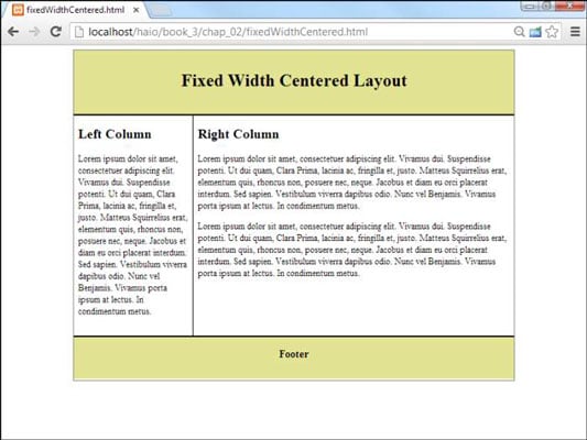
<!DOCTYPE html>
<html lang = "en-US">
 <head>
 <meta charset = "UTF-8">
 <title>fixedWidthCentered.html</title>
 <link rel = "stylesheet"
   type = "text/css"
   href = "fixedWidthCentered.css" />
 </head>
 <body>
 <div id = "all">
  <div id = "header">
  <h1>Fixed Width Centered Layout</h1>
  </div>
  <div id = "left">
  <h2 id="tab2" >Left Column</h2>
  </div>
  <div id = "right">
  <h2 id="tab3" >Right Column</h2>
  </div>
  <div id = "footer">
  <h3>Footer</h3>
  </div>
 </div>
 </body>
</html>
The entire page contents are now encapsulated in a special div. This div will be resized to a standard width (typically 640 or 800 pixels). The all element will be centered in the body, and the other elements will be placed inside all as if it were the body:
#all {
 width: 800px;
 height: 600px;
 margin-left: auto;
 margin-right: auto;
 border: 1px solid gray;
}
#header {
 background-color: #e2e393;
 border-bottom: 3px solid black;
 text-align: center;
 width: 800px;
 height: 100px;
 padding-top: 1em;
}
#left {
 float: left;
 width: 200px;
 clear: left;
 border-right: 1px solid black;
 height: 400px;
 padding-right: .5em;
}
#right {
 float: left;
 width: 580px;
 height: 400px;
 padding-left: .5em;
}
#footer {
 width: 800px;
 height: 60px;
 text-align: center;
 background-color: #e2e393;
 border-top: 3px double black;
 padding-bottom: 1em;
 clear: both;
}
How the jello layout works
This code is very similar to the style, but it has some important new features:
The all element has a fixed width. This element's width will determine the width of the fixed part of the page.
all also needs a fixed height. If you don't specify a height, all will be 0 pixels tall because all the elements inside it are floated.
Center. Remember, to center divs (or any other block-level elements) you set margin-left and margin-right both to auto.
Do not float all. The margin:auto trick doesn't work on floated elements. all shouldn't have a float attribute set.
Ensure the interior widths add up to all’s width. If all has a width of 800 pixels, be sure that the widths, borders, and margins of all the elements inside all add up to exactly 800 pixels. If you go even one pixel over, something will spill over and mess up the effect. You may have to fiddle with the widths to make everything work.
Adjust the heights: If your design has a fixed height, you'll also need to fiddle with the heights to get everything to look exactly right. Calculations will get you close, but you'll usually need to spend some quality time fiddling with exact measurements to get everything just right.
Limitations of the jello layout
Jello layouts represent a compromise between fixed and fluid layouts, but they aren't perfect:
Implicit minimum width: Very narrow browsers (like cellphones) can't render the layout the way you want. Fortunately, the content will still be visible, but not in exactly the format you wanted.
Wasted screen space: If you make the rendered part of the page narrow, a lot of space isn't being used in higher-resolution browsers. This can be frustrating.
Complexity: Although this layout technique is far simpler than table-based layouts, it's still a bit involved. You do have to plan your divs to make this type of layout work.