If you’re graphing several functions on your TI-84 Plus calculator at once, your calculator automatically graphs each function in a different color. If you have the TI-84 Plus C, you may want to change the colors more to your liking or further distinguish your functions by choosing a different graph style. To do this, follow these steps:
Press [Y=] to access the Y= editor.
Use the left-arrow key to place the cursor on the two-piece icon appearing to the left of the equal sign.
See the first screen. The icon displays two pieces, a rectangular color indicator and a line style icon. Take a quick glance to the left of a function and identify the color and graph line style.
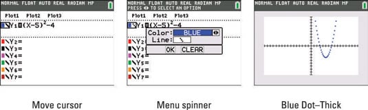
Press e to open the Color / Line selection menu.
See the second screen.
Use the following keys to operate the spinner menu until you get the desired graph color.

There are 15 colors to choose from: Blue, Red, Black, Magenta, Green, Orange, Brown, Navy, Light Blue, Yellow, White, Light Gray, Medium Gray, Gray, and Dark Gray.
Use the down-arrow key or press e to navigate your cursor to the next selection field in the menu.
Use the following keys to operate the spinner menu until you get the desired graph line style.

You have eight graph line styles to choose from: Line, Thick Line–Default, shading above the curve, shading below the curve, Path, Animate, Dotted–Thick, and Dotted–Thin.
Use the down-arrow key or press e to navigate your cursor to OK, and press [ENTER].
If you change your mind, navigate to CLEAR and press [ENTER]. This nullifies any changes you made to the color or graph line style. See an example of a function with dotted–thick graph line style in the third screen.
Here are the different line styles available:
Thin Line, Thick Line, Dotted Thin Line, and Dotted Thick Line: The default graph style setting is Thick Line. See the first screen here.
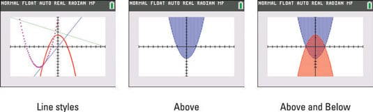
Shading above and below the curve styles: See the second screen for an example of shading above the curve style.
Your calculator has four shading patterns: vertical lines, horizontal lines, negatively sloping diagonal lines, and positively sloping diagonal lines. These patterns help you to distinguish the solution region for a system of inequalities. See the third screen.
Path and Animated styles: The Path style uses a circle to indicate a point as it’s being graphed (as illustrated in the first screen). When the graph is complete, the circle disappears and leaves the graph in Line style.
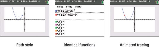
The animate style also uses a circle to indicate a point as it’s being graphed, but when the graph is complete, no graph appears on the screen. For example, if this style is used, graphing y = –x2 + 9 looks like a movie of the path of a ball thrown in the air.
You can use the animate tool to demonstrate that two functions are identical. At first glance, the functions in the second screen may not look identical. However, the animate tool shows they are identical as the bubble traces the original function. See the third screen.