
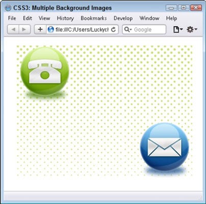
With CSS3, you can easily add as many background images to any one element as you please. You can also rotate images. The illustration shows an example of a container with three background images, a pattern, and two PNG files with transparency.
The simplest way to add multiple images is to separate each by a comma, making sure to place the image you want to be in the topmost position first and any additional images below it in the desired stacking order:
.box {
/* fallback */
background: url(bg-full.png) top left no-repeat;
/* modern browsers */
background:
url(bg-top.png) top left no-repeat,
url(bg-bottom.png) bottom right no-repeat,
url(bg-middle.png) left repeat-x;
}
As a fallback for older browsers, you can include a single image that has all the combined elements of your separate images at the top of the style block, as noted here by the /* fallback */ comments. This method ensures that older browsers display the first image and ignore the rest.
As a web designer, one of the ways you can add some interest to your 2D design is to break away from the linear structure of the grid by rotating an object in space. With CSS3, you can effortlessly rotate an object by applying the transform: rotate style to any object:
.rotate {
  transform:rotate(-4deg);
  -webkit-transform:rotate(-4deg); /* Safari and Chrome */
  -moz-transform:rotate(-4deg); /* Firefox */
  -o-transform:rotate(-4deg); /* Opera */
}
Objects can be rotated clockwise (4deg) or counterclockwise (-4deg). You may also scale and skew an object with the scale() and skew() transform methods by specifying numerical values or degrees for the X-axis and Y-axis:
div {
  transform: scale(3,6);
  -ms-transform: scale(3,6); /* IE 9 */
  -webkit-transform: scale(3,6); /* Safari and Chrome */
  -o-transform: scale(3,6); /* Opera */
  -moz-transform: scale(3,6); /* Firefox */
  }
div {
  transform: skew(10deg,20deg);
  -ms-transform: skew(10deg,20deg); /* IE 9 */
  -webkit-transform: skew(10deg,20deg); /* Safari and Chrome */
  -o-transform: skew(10deg,20deg); /* Opera */
  -moz-transform: skew(10deg,20deg); /* Firefox */
  }