In addition to data, geoms, and stats, the full specification of a ggplot2 in R includes facets and scales. Facets allow you to visualize different subsets of your data in a single plot. Scales include not only the x-axis and y-axis, but also any additional keys that explain your data (for example, when different subgroups have different colors in your plot).
Adding facets
To make the basic scatterplot of fuel consumption against performance, use the following:
> p <- ggplot(mtcars, aes(x = hp, y = mpg)) + geom_point()
> p
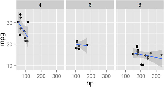
Then, to add facets, use the function facet_grid(). This function allows you to create a two-dimensional grid that defines the facet variables. You write the argument to facet_grid() as a formula of the form rows ~ columns. In other words, a tilde (~) separates the row variable from the column variable.
To illustrate, add facets with the number of cylinders as the columns. This means your formula is ~cyl. Notice that because there are no rows as facets, there is nothing before the tilde character:
> p + stat_smooth(method = "lm") + facet_grid(~ cyl)
Your graphic should look like this.
Similar to facet_grid(), you also can use the facet_wrap() function to wrap one dimension of facets to fill the plot grid.
Working with scales
In ggplot2, scales control the way your data gets mapped to your geom. In this way, your data is mapped to something you can see (for example, lines, points, colors, position, or shapes).
The ggplot2 package is extremely good at selecting sensible default values for your scales. In most cases, you don’t have to do much to customize your scales. However, ggplot2 has a wide range of very sophisticated functions and settings to give you fine-grained control over your scale behavior and appearance.
In the following example, you map the column mtcars$cyl to both the shape and color of the points. This creates two separate, but overlapping, scales: One scale controls shape, while the second scale controls the color of the points:
> p <- ggplot(mtcars, aes(x = hp, y = mpg)) +
+  geom_point(aes(shape = factor(cyl), colour = factor(cyl)))
The name of a scale defaults to the name of the variable that gets mapped to it. In this case, you map factor(cyl) to the scale. To change the appearance of a scale, you need to add a scale function to your plot. The specific scale function you use is dependent on the type of scale, but in this case, you have a shape scale with discrete values, so you use the scale_shape_discrete() function.
You also have a color scale with discrete value, so you can control that with scale_colour_discrete(). To change the name that appears in the legend of the plot, you need to specify the argument name to these scales. For example, change the name of the legend to “Cylinders” by setting the argument name = “Cylinders”:
> p +
+  scale_shape_discrete(name = "Cylinders") +
+  scale_colour_discrete(name = "Cylinders")
Similarly, to change the x-axis scale, you would use scale_x_continuous().
Changing options
In ggplot2, you also can take full control of your titles, labels, and all other plot parameters.
To add x-axis and y-axis labels, you use the functions xlab() and ylab().
To add a main title, you use the function ggtitle():
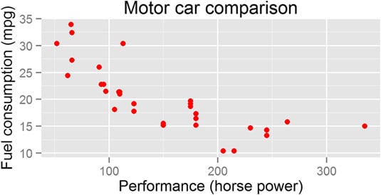
> ggplot(mtcars, aes(x = hp, y = mpg)) + geom_point(color = "red") +
+   xlab("Performance (horse power)") +
+   ylab("Fuel consumption (mpg)") +
+   ggtitle("Motor car comparison")
Your graphic should look like the image below.