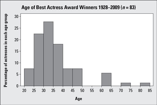
The preceding graph is a histogram showing the ages of winners of the Best Actress Academy Award; you can see it is skewed right. The following table includes calculations of some basic (that is, descriptive) statistics from the data set. Examining these numbers, you find the median age is 33.00 years and the mean age is 35.69 years:
The mean age is higher than the median age because of a few actresses that were quite a bit older than the rest when they won their awards. For example, Jessica Tandy won for her role in Driving Miss Daisy when she was 81, and Katharine Hepburn won the Oscar for On Golden Pond when she was 74. The relationship between the median and mean confirms the skewness (to the right) found in the first graph.
Here are some tips for connecting the shape of a histogram with the mean and median:
-
If the histogram is skewed right, the mean is greater than the median.
This is the case because skewed-right data have a few large values that drive the mean upward but do not affect where the exact middle of the data is (that is, the median).
-
If the histogram is close to symmetric, then the mean and median are close to each other.
Close to symmetric means the data are roughly the same in height and location on either side of the center of the histogram; it doesn't need to be exact.
Close is defined in the context of the data; for example, the numbers 50 and 55 are said to be close if all the values lie between 0 and 1,000, but they are considered to be farther apart if all the values lie between 49 and 56.
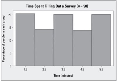
The histogram shown in this graph is close to symmetric. Its mean and median are both equal to 3.5:
-
If the histogram is skewed left, the mean is less than the median.
This is the case because skewed-left data have a few small values that drive the mean downward but do not affect where the exact middle of the data is (that is, the median).
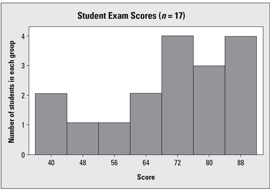
The following graph represents the exam scores of 17 students, and the data are skewed left. The mean and median of the original data set are calculated to be 70.41 and 74.00, respectively. The mean is lower than the median due to a few students who scored quite a bit lower than the others. These findings match the general shape of the histogram shown in the graph:
If for some reason you don't have a histogram of the data, and you only have the mean and median to go by, you can compare them to each other to get a rough idea as to the shape of the data set.
-
If the mean is much larger than the median, the data are generally skewed right; a few values are larger than the rest.
-
If the mean is much smaller than the median, the data are generally skewed left; a few smaller values bring the mean down.
-
If the mean and median are close, you know the data is fairly balanced, or symmetric, on each side (but not necessarily bell-shaped).