A histogram is a special graph applied to statistical data broken down into numerically ordered groups; for example, age groups such as 10–20, 21–30, 31–40, and so on. A histogram provides a snapshot of all the data, making it a quick way to get the big picture of the data, in particular, its general shape.
In a histogram, the bars connect to each other — as opposed to a bar graph for categorical data, where the bars represent categories that don't have a particular order, and are separated. The height of each bar of a histogram represents either the number of individuals (called the frequency) in each group or the percentage of individuals (the relative frequency) in each group. Each individual in the data set falls into exactly one bar.
You can make a histogram from any numerical data set; however, you can't determine the actual values of the data set from a histogram because all you know is which group each data value falls into.
Here's an example: The Academy Awards started in 1928, and one of the most popular categories is Best Actress in a Motion Picture. The table shows the winners of the first eight Best Actress Oscars, the years they won (1928–1935), their ages at the time of winning their awards, and the movies they were in. From the table, you see the ages range from 22 to 62 — much wider than you may have thought it would be.
| Year | Winner | Age | Movie |
|---|---|---|---|
| 1928 | Laura Gainor | 22 | Sunrise |
| 1929 | Mary Pickford | 37 | Coquette |
| 1930 | Norma Shearer | 30 | The Divorcee |
| 1931 | Marie Dressler | 62 | Min and Bill |
| 1932 | Helen Hayes | 32 | The Sin of Madelon ClaudetT |
| 1933 | Katharine Hepburn | 26 | Morning Glory |
| 1934 | Collette Colbert | 31 | It Happened One Night |
| 1935 | Bette Davis | 27 | Dangerous |
To find out more about the ages of Best Actress Award winners, expand the data set to the period 1928–2009. The age variable for this data set is numerical, so you can graph it using a histogram. From there you can answer questions like: What do the ages of these actresses look like? Are they mostly young, old, in between? Are their ages all spread out, or are they similar? Are most of them in a certain age range, with a few outliers (either very young or very old actresses, compared to the others)? To investigate these questions, a histogram of ages of the Best Award actresses is shown here:
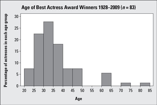
Notice that the age groups are shown on the horizontal (x) axis. They go by groups of 5 years each: 20–25, 25–30, 30–35, . . . 80–85. The percentage (relative frequency) of actresses in each age group appears on the vertical (y) axis. For example, about 27 percent of the actresses were between 30 and 35 years of age when they won their Oscars.
What if a winner is 30 years old? Does she belong in 25–30 or 30–35? As long as you are consistent with all the data points, you can either put all the borderline points into their respective lower bars or put all of them into their respective upper bars. The important thing is to pick a direction and be consistent. It is common practice to make the bar intervals left inclusive (that is, the bars include the left endpoint but not the right).