
A pie chart takes categorical data from a statistical sample and breaks them down by group, showing the percentage of individuals that fall into each group. Because a pie chart takes on the shape of a circle, the "slices" that represent each group can easily be compared and contrasted.
Because each individual in the study falls into one and only one category, the sum of all the slices of the pie should be 100% or close to it (subject to a bit of rounding off). However, just in case, keep your eyes open for pie charts whose percentages just don't add up.
A recent Census Bureau population report looked at what it calls the "older U.S. population" (by the government's definition, this means people 65 years old or over). Age was broken into the following groups: 65–69 years, 70–74 years, 75–79 years, 80–84 years, and 85 and over. The Bureau calculated and reported the percentage in each age group for the year 2010 and made projections for the percentage in each age group for the year 2050.
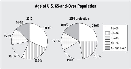
This image shows side-by-side pie charts for the years 2010 versus 2050 (projections) to make comparisons. The percentage of the older population in each age group for 2010 is shown in one pie chart, and alongside it is a pie chart of the projected percentage for each age group for 2050 (based on the current age of the entire U.S. population, birth and death rates, and other variables).
If you compare the sizes of the slices from one graph to the other in the image, you see that the slices for corresponding age groups have a greater in percentage points going from 2010 to 2050 as the age groups get older, and the slices have a smaller increase in percentages (and in some cases, a decrease in percentage points) from 2010 to 2050 as the age groups get younger. For example, the 85-and-over age group increases from 14% in 2010 to 19% projected for 2050 — an increase of 5 percentage points, while the 65–69 age group decreases from 30% in 2010 to a projected 25% in 2050 — a decrease of 5 percentage points..
The results from the image indicate a shift in the ages of the population toward the older categories. From there, the medical and social research communities can examine the ramifications of this trend in terms of healthcare, assisted living, social security, and so on.
In this example, the pie charts in the image work well for comparing groups because they are side-by-side on the same graph, using the same coding for the age groups in each, and their slices are in the same order for both as you move clockwise around the graphs. They aren't all scrambled up on each graph so you have to hunt for a certain age group on each graph separately.
The following tips help you taste test a pie chart for statistical correctness:
Check to be sure the percentages add up to 100% or very close to it (any round-off error should be very small).
Beware of slices of the pie called "Other" that are larger than many of the other slices.
Look for a reported total number of units (people, dollar amounts, and so on) so that you can determine (in essence) how "big" the pie was before being divided up into the slices that you're looking at.
Avoid three-dimensional pie charts; they don't show the slices in their proper proportions. The slices in front look larger than the percentage they represent.