A histogram is a graph that represents the probability distribution of a dataset. A histogram has a series of vertical bars where each bar represents a single value or a range of values for a variable. The heights of the bars indicate the frequencies or probabilities for the different values or ranges of values.
For example, this figure shows a histogram of the daily prices of Apple stock from January 1, 2013 to December 31, 2013.
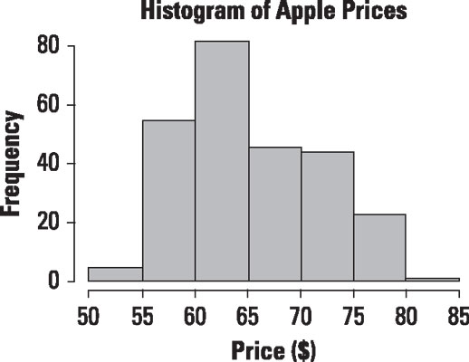
According to this histogram, most of the prices were between $60 and $65; the price was in this range 81 times during the year. The second most frequently observed prices were between $55 and $60; the price landed in this range 44 times during the year. The third most frequent range of prices was between $65 and $70, and the fourth most frequent range of prices was between $70 and $75. Very few prices were between $50 and $55, and the fewest prices observed during the year were between $80 and $85.
Based on the graph, the mean and median price were close to the $60 to $65 range. The actual mean was $65.67, and the actual median was $63.65. Since the mean exceeds the median, the distribution of prices for 2013 was positively skewed. This indicates that the likelihood of an extremely large price is somewhat greater than the likelihood of an extremely low price.
A distribution is positively skewed if the mean is greater than the median; it is negatively skewed if the mean is less than the median. The distribution is symmetrical about the mean if the mean equals the median. How much the data is skewed depends on how far the mean and median differ. If they are very close, it's sometimes practical to treat the distribution as symmetric.
As another example, this figure shows a histogram of the daily prices of the S&P 500 stock index from January 1, 2013 to December 31, 2013.
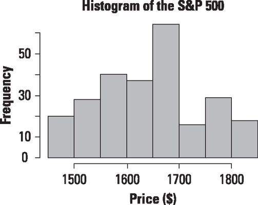
According to the histogram in Figure 12-10, the most frequently observed range of prices during the year was between $1,650 and $1,700. The mean turned out to be $1,643.80, and the median was $1,650.41. Unlike Apple stock, the mean was below the median; the distribution of prices for 2013 is negatively skewed. This indicates that there was a slightly greater tendency for the Standard and Poor's 500 to trade below the mean than above the mean in 2013.
One of the most important uses of histograms is to determine if a dataset follows a specified probability distribution. Although there are many formal statistical tests to determine which probability distribution a dataset follows, it's good practice to visually inspect the data with a graph before engaging in any formal statistical tests.
The histogram of Apple prices provides strong evidence that Apple stock prices are not normally distributed. The normal distribution is symmetrical about its mean, whereas the Apple stock prices are positively skewed. The histogram of S&P prices provides strong evidence that the S&P 500 is also unlikely to be normally distributed because its distribution is negatively skewed.
Formal statistical tests would be required to show that neither distribution is normal, but the graphs are highly suggestive. Because many statistical tests are based on the assumption of normality, it's important to determine if a distribution is truly normal before you use any of these tests.