EDA is based heavily on graphical techniques. You can use graphical techniques to identify the most important properties of a dataset. Here are some of the more widely used graphical techniques:
Box plots
Histograms
Normal probability plots
Scatter plots
Box plots
You use box plots to show some of the most important features of a dataset, such as the following:
Minimum value
Maximum value
Quartiles
Quartiles separate a dataset into four equal sections. The first quartile (Q1) is a value such that the following is true:
25 percent of the observations in a dataset are less than the first quartile.
75 percent of the observations are greater than the first quartile.
The second quartile (Q2) is a value such that
50 percent of the observations in a dataset are less than the second quartile.
50 percent of the observations are greater than the second quartile.
The second quartile is also known as the median.
The third quartile (Q3) is a value such that
75 percent of the observations in a dataset are less than the third quartile.
25 percent of the observations are greater than the third quartile.
You can also use box plots to identify outliers. These are values that are substantially different from the rest of the dataset. Outliers can cause problems for traditional statistical tests, so it's important to identify them before performing any type of statistical analysis.
Histograms
You use histograms to gain insight into the probability distribution that a dataset follows. With a histogram, the dataset is organized into a series of individual values or ranges of values, each represented by a vertical bar. The height of the bar shows how frequently a value or range of values occurs. With a histogram, it's easy to see how the data is distributed.
Scatter plots
A scatter plot is a series of points that show how two variables are related to each other. A random scatter of points indicates that the two variables are unrelated, or that the relationship between them is very weak. If the points closely resemble a straight line, this indicates that the relationship between the two variables is approximately linear.
Two variables are linearly related if they can be described with the equation Y = mX + b.
X is the independent variable, and Y is the dependent variable. m is the slope, which represents the change in Y due to a given change in X. b is the intercept, which shows the value of Y when X equals zero.
The figure shows a scatter plot between two variables in which the relationship appears to be linear.
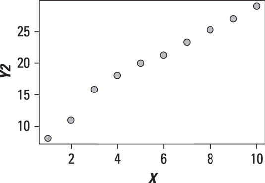
The points on the scatter plot very nearly form a straight line. It bends a little to the left and bends a little to the right, but it's roughly straight. This shows that the relationship is linear, with a positive slope.
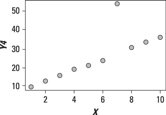
The following figure shows a scatter plot between two variables in which Y appears to be rising more rapidly than X.
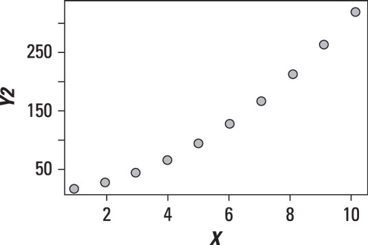
See the curve? This relationship is clearly not linear. It is in fact a quadratic relationship. A quadratic relationship takes the form Y = aX2 + bX + c.
The following figure shows a scatter plot in which there doesn't appear to be any relationship between X and Y.
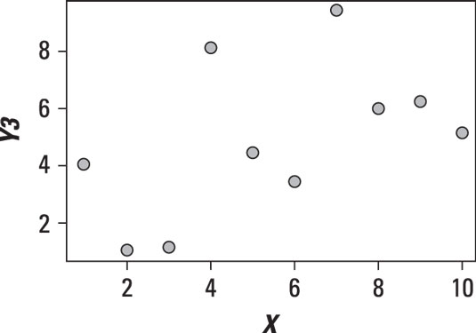
The variables in the scatter plot shown are unrelated or independent; you can see this by the lack of any pattern in the data.
In addition to showing the relationship between two variables, a scatter plot can also show the presence of outliers. The following figure shows a dataset with one observation that is substantially different from the other observations.
The outlier point needs to be investigated further to determine whether it's the result of an error or other problems. It's possible that the outlier will need to be removed from the data.
Normal probability plots
Normal probability plots are used to see how closely the elements of a dataset follow the normal distribution. The assumption of normality is common in many disciplines. For example, it's often assumed in finance and economics that the returns to stocks are normally distributed. The assumption of normality is very convenient, and many statistical tests are based on this assumption.
Applying statistical tests that assume normality to a non-normal dataset would give extremely questionable results. Therefore, it's important to determine whether or not the data is normally distributed before conducting any of these statistical tests.